We've updated our Pie Chart visualization to provide an even more complete view of your data.
Key Benefits
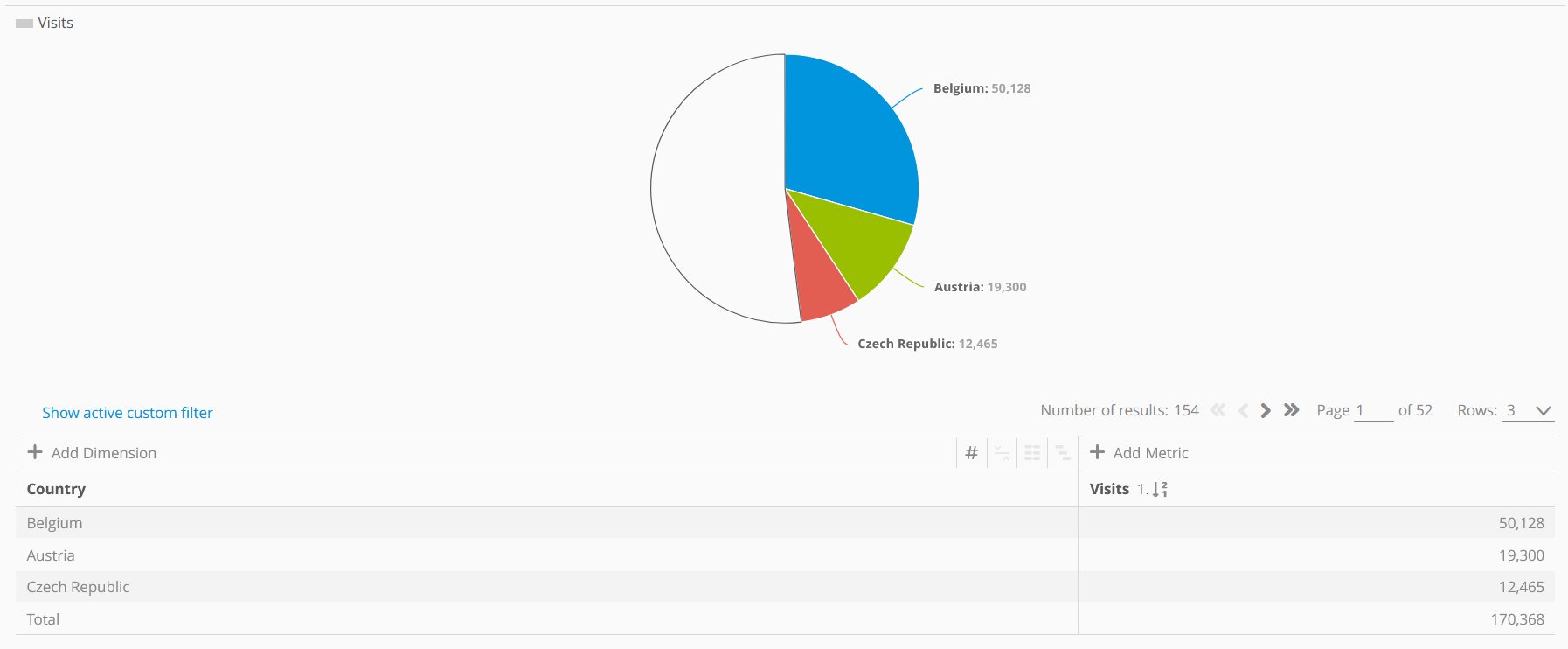
We now provide an 'Other' segment, shown in white on the chart. This section represents all the remaining data not included in the selected rows, making the total distribution clear.
The value of the metrics has been added to the chart.
We're increasing the prominence of the legend for all chart visualizations.
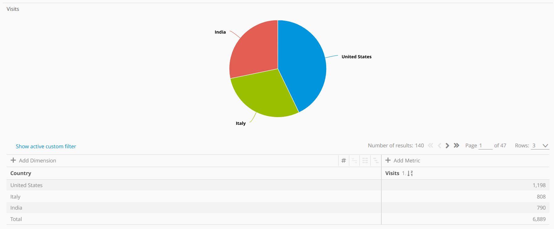
Before
Our charts always represent only the selected rows. As such, 100% of the information isn't included despite how a pie chart may appear.
Now
Whereas above, it's unclear that nearly 60% of the total data isn't included in the chart; you can see the split clearly below.