Standard Onboarding: CMS2 Blocks User Manual
Introduction to CMS
Standard Content Management System (CMS). A content management system is a tool that helps build Email Templates and Email Messages without needing resources such as an Email Developer or any HTML experience. The pre-built Framework and Blocks enable the creation of email templates that can be styled and reused over & over. As well as creating new and ad-hoc email templates and messages as required.
This document contains a list of new and improved blocks. All blocks have the standard editing features and some interactive blocks that require a little more setup. 
Main Elements
Framework: The Framework provides the HTML foundation for your email messages and determines how messages are displayed on the recipient's devices. The Framework caters to all major email clients (with some exceptions where older versions of Outlook are concerned), and we take a responsive design approach. Therefore, all emails will be mobile-friendly as standard. The Framework is flexible and reusable, and every message requires it.
Blocks: A block is a code module containing a specific element of content for an email. An example is the 07 - Hero Image block, where an image can be uploaded, resized, and added to an external link. Each block contains reusable layout, design, and formatting options, which are editable via the Editing Toolbar or in the Details Tab.
All blocks can be dragged from the Components tab and dropped into a Template or Message.
Email Template: Email templates are created using the Framework, and adding blocks in any combination can create layout variations. A good example is a standard weekly Newsletter. A Newsletter layout doesn't generally change from week to week. Only the content changes. Creating a Newsletter template saves time as the layout is already pre-defined. Create a new newsletter message from the newsletter template and add the latest news content in each block. Quick and easy, flexible and reusable.
Email Messages: As mentioned above, create a message from a pre-defined template or an ad-hoc email. At this point, adding and removing blocks without affecting the underlying template is still possible. The new message becomes a stand-alone element, not dependent on the template thereafter.
Drag and Drop Editor: The Components and Details Tabs can be found here. And where blocks are added to create templates or messages. Both the Template window and Message window utilize the Drag & Drop Editor. Find the required block in the Components Tab list and drag & drop it into the editing window.
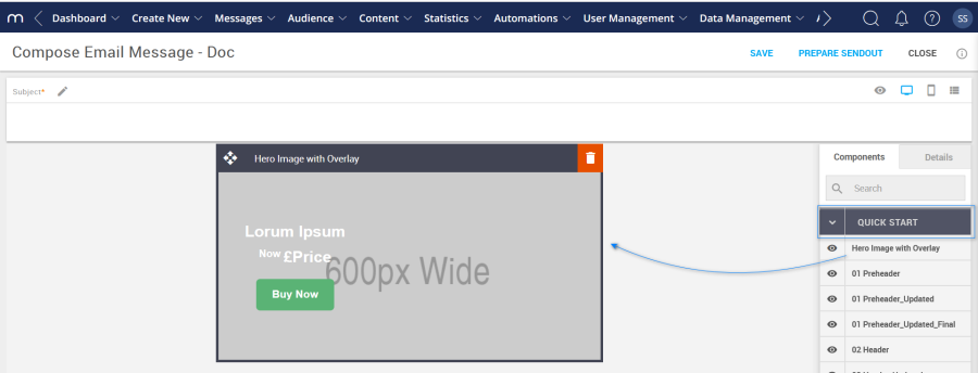
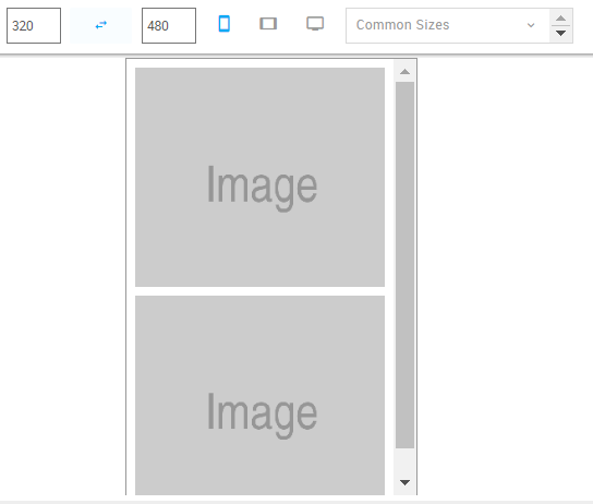
Preview Window: Clicking on the 'eye' icon reveals a preview window of how your block and its contents will look in a message. Block content can also be viewed in different device views and dimensions. 
Generic Settings
Visual Editor:
This is where template and message editing occurs via the details tab or editing toolbar. Such as formatting text, applying brand Colors, adding images, links, buttons, etc.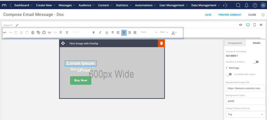
Advanced Tab:
The Advanced Tab settings can be found by selecting the info icon shown in the screenshot below. While creating a template or message, these settings are available but are Framework level. These settings update variables only found in the Framework and some mobile settings that cannot be accessed via the Details Tab, Hence, these changes apply to all the relevant elements within the current template or message being created. 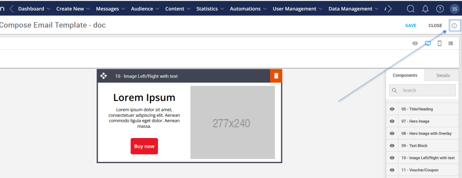
Below are the options available for the QuickStart 2023 Framework in the Advanced Tab.
Template Title: Rename the template with a brand name. This will be displayed on a browser's page tab.
Option
Details
Default
Template
Title
Quick Start 2023
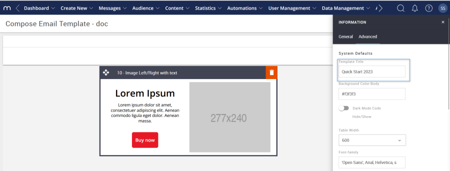
Background Color: Used to change the email background Color.
Option
Details
Default
Background Color
Email background Color
#f3f3f3
Dark Mode Code Hide/Show: This toggle hides or shows the dark mode code in the Framework. As a note, some consideration needs to be applied when deciding what dark mode options will be in place.
Option
Details
Default
Hide/Show
Darkmode Code option
Hide
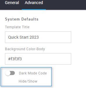
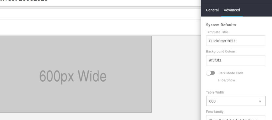
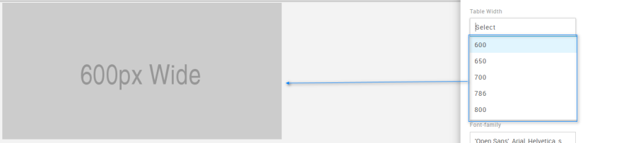
Table Width: Used to select a specific width for a template or message. There are five width options to choose from via a drop-down menu.
Option
Details
Drop-down
Default
Width
Table Width selection
600
600
650
700
786
800
Font Family: This option sets the global font stack for the template or message that is currently being created. Each individual block is still able to use a different font.
Option
Details
Default
Font Family
Font Family
'Open Sans', Arial, Helvetica, sans-serif
Mobile Title Font Size: Global mobile font size setting for all blocks that use a Title (also known as heading). This is applicable to all blocks that contain a title. Some examples are below.
Option
Details
Default
Font Size
Mobile Title Font Size
18
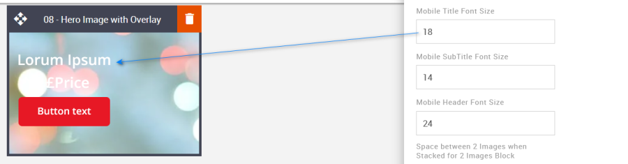
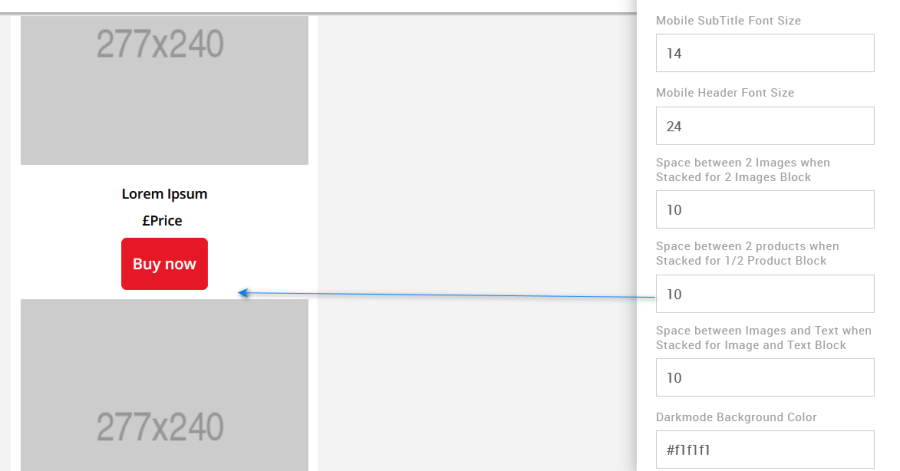
Mobile SubTitle Font Size: Global mobile font size setting for all blocks that use a SubTitle (also known as a subheading). This is applicable to all blocks that contain a SubTitle.
Option
Details
Default
Font Size
Mobile Subtitle Font Size
14
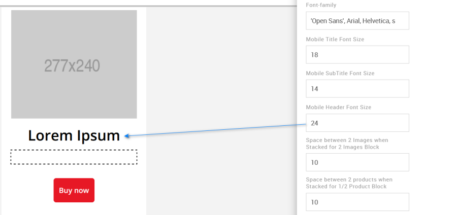
Mobile Header Font Size: Global mobile font size setting for all blocks that use a Header.
Option
Details
Default
Font Size
Mobile Header Font Size
24
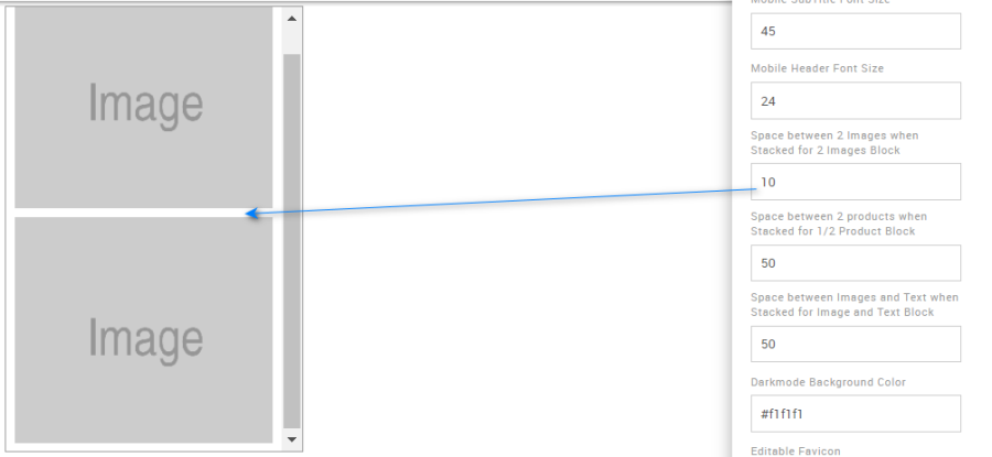
Space between two Images: Use this option to edit the space between the images for the mobile view when images are stacked. Specific to block 12 – 2 images.
Option
Details
Default
Space between two Images
Space between two Images when Stacked in Mobile
10
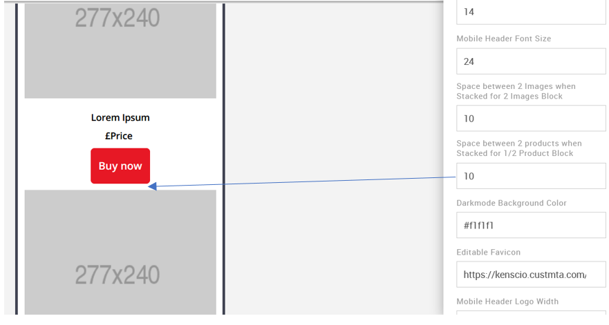
Space between two Products: Use this option to edit the space between the images for the mobile view when images are stacked. Specific to block 13 - 1 or 2 Products.
Option
Details
Default
Space between two Products
Space between two Products when Stacked in Mobile
10
Dark Mode Background Color: It allows you to change the Dark mode body background color. This color will appear when it is viewed in dark mode.
Option
Details
Default
Dark Mode Background Color
Dark Mode Body Background Color
#f1f1f1
Editable Favicon: This option is used to change the Favicon.
Option
Details
Default
Editable Favicon
Title bar icon in the browser
https://amundsen.shortest-route.com/cts-demo/imgproxy/img/2040334902/mapp_favicon.ico
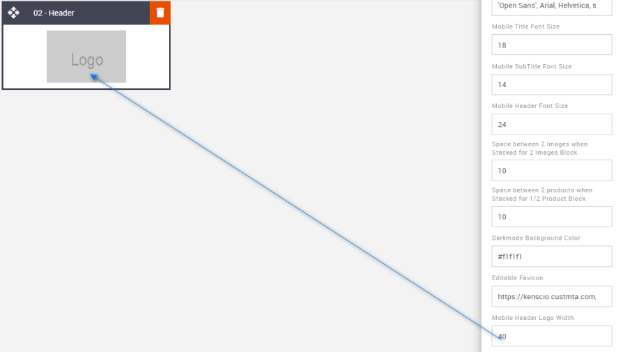
Mobile Header Logo Width: It allows you to update the mobile logo width. This is applicable to block 02 – Logo Header.
Option
Details
Default
Logo Width
Mobile Header Logo Width
80
Desktop Body Background Image Path: Used to add an email background image. All blocks will overlay the background image.
Option
Details
Default
Background Image
Desktop Background Image path for Body
Blank
Compatibility:
CTA's with curved corners will not display as curved when they are placed on top of a background image. When images are configured as background images, this limits the type of functionality that can be applied to the image and anything it is overlaid with. This is industry-wide.
Blocks
There are 27 blocks in total, each unique, and can only be used with the QuickStart 2023 Framework. The details of each block are explained over the coming pages. All blocks can be found in a folder called "QuickStart 2023"
Block name:
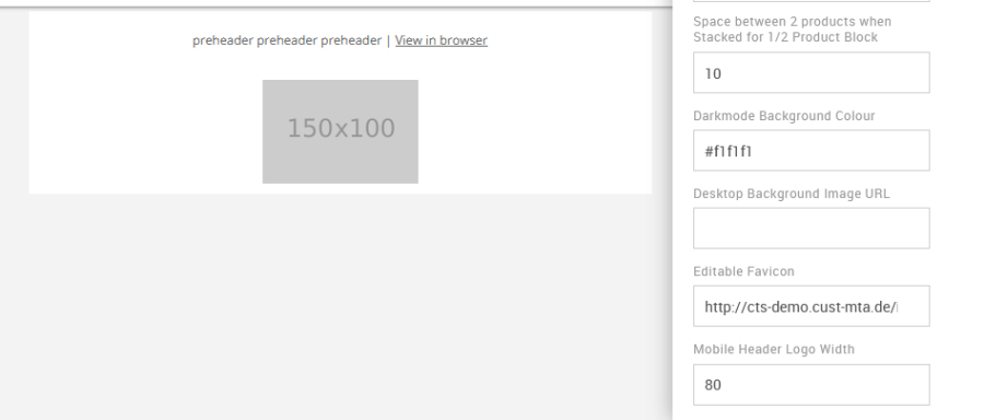
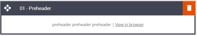
01 – Preheader
Description:
Preheader text - used to summarize the email content, a call-to-action, or an incentive to encourage recipients to open an email. This feature also contains the View in Browser link. There are a few options to choose from including hiding or showing the preheader on mobile or hiding altogether just leaving it visible in the inbox list view.
When clicked, the View in browser text will open the email message in the recipient's browser of choice.
Default block view:
Desktop | Mobile (Hidden Preheader) |
|---|---|
|
|
Formatting options:
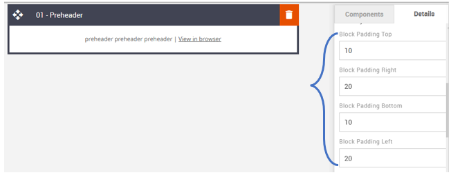
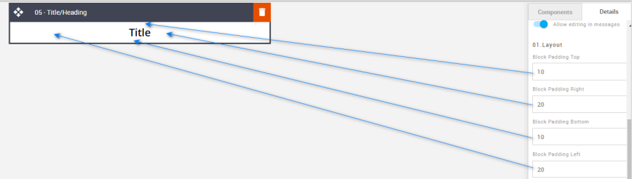
Padding: This refers to the space between the content of the block and its border. This can be edited in the Details Tab.
Option
Details
Default
Padding
Top
10
Right
20
Bottom
10
Left
20
Hide/Show Preheader Text: Used to hide or show the preheader text in Desktop view.
Option
Details
Default
Hide/Show
Desktop
Show
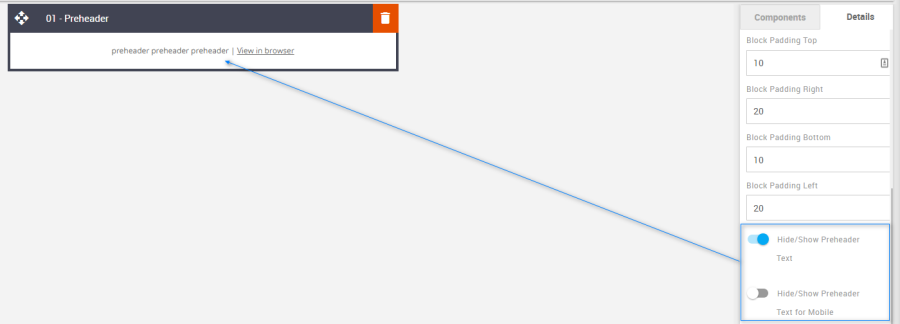
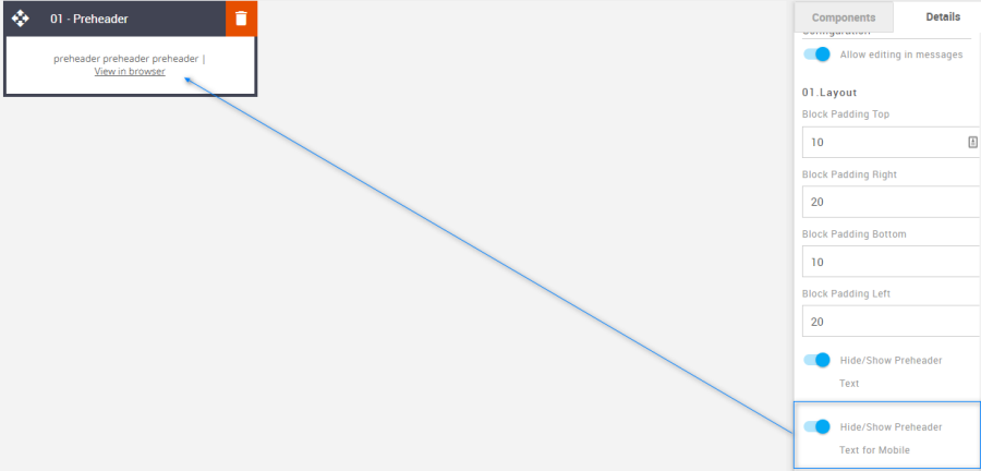
Hide/Show Preheader Text for Mobile: Used to hide or show the preheader text in mobile view.
Option
Details
Default
Hide/Show
Desktop
Show
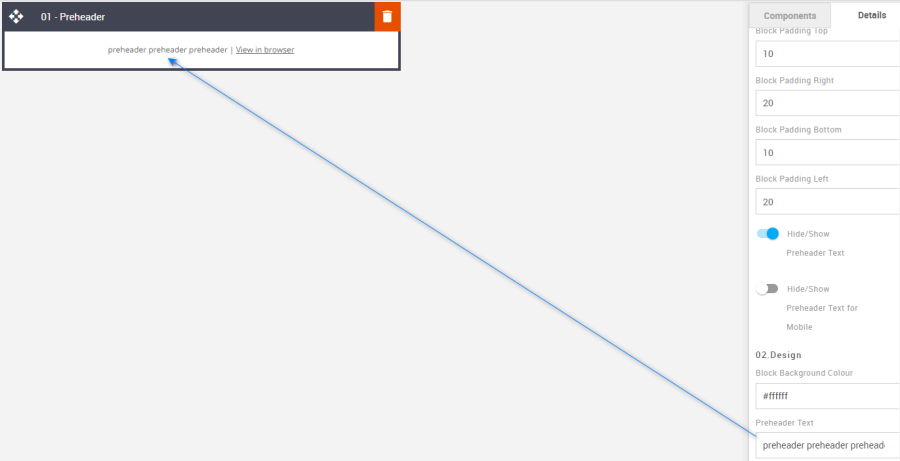
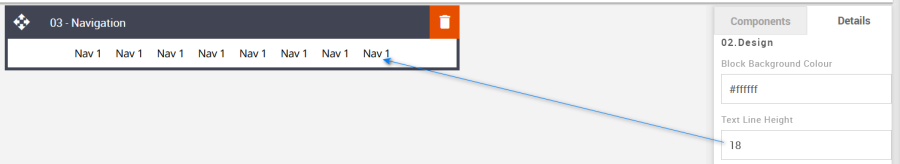
Block Background Color: Used to change the block background color. Only use HEX color values. HTML email only recognizes 6-digit long-hand versions and has patchy support for shorthand versions.
Option
Details
Default
Background Color
Block Background Color
#ffffff
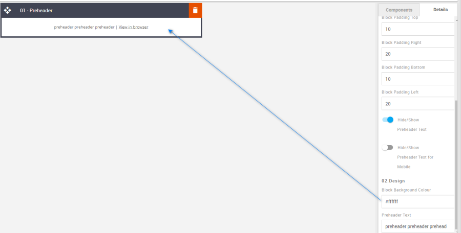
Preheader Text: This is where the preheader text is entered.
Option
Details
Default
Preheader
Text
preheader preheader preheader
Compatibility:
There are no known render issues with this block.
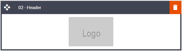
02 – Logo Header
Description:
Add a brand logo, and set its alignment and size on desktop and mobile.
Default block view:
Desktop | Mobile |
|---|---|
|
|
Formatting options:
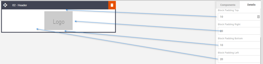
Padding: This refers to the space between the content of the block and its border. This can be edited in the Details Tab.
Option
Details
Default
Padding
Top
10
Right
20
Bottom
10
Left
20
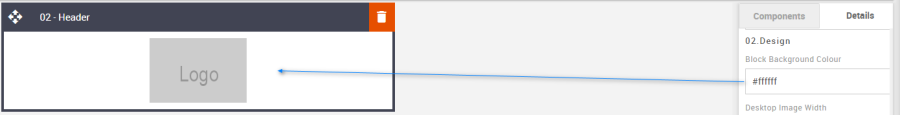
Block Background Color: Used to change the block background color. Only use HEX color values. HTML email only recognizes 6-digit long-hand versions and has patchy support for shorthand versions.
Option
Details
Default
Background Color
Block Background Color
#ffffff
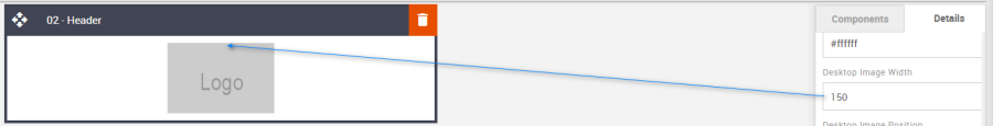
Desktop Image Width: Used to change the width of a logo image in desktop view.
Option
Details
Default
Image width
Desktop Image width
150
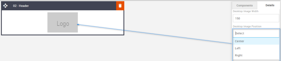
Desktop Image Position: Change the image alignment in the desktop view using the drop-down.
Option
Details
Dropdown
Default
Image Position
Desktop
Center
Center
Left
Right
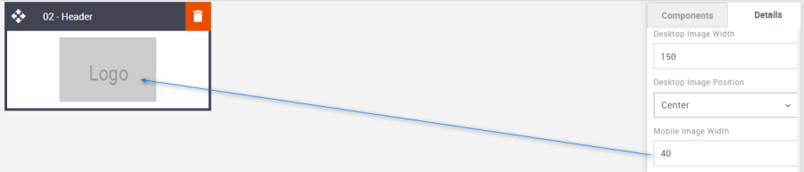
Mobile Image Width: Used to change the width of the logo image for mobile view.
Option
Details
Default
Image width
Mobile Image width
80
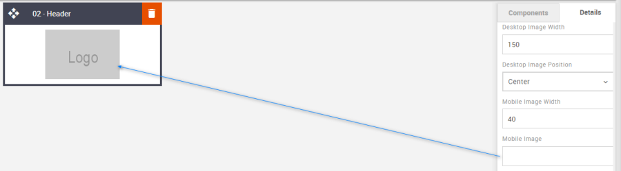
Mobile Image: A separate image for mobile view can be applied if required. First, load the image to the content store. Then paste the image URL into the Details Tab field. However, if one is not added the system will use the desktop version and the mobile sizes set.
Option
Details
Default
Image
Mobile Image path
Blank
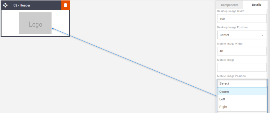
Mobile Image Position: Change the image alignment in the mobile view using the drop-down.
Option
Details
Dropdown
Default
Image Position
Mobile
Center
Center
Left
Right
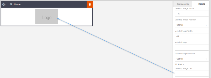
Desktop Image Link: Used to set the image link for the desktop.
Option
Details
Default
Links
Desktop Image link
Blank
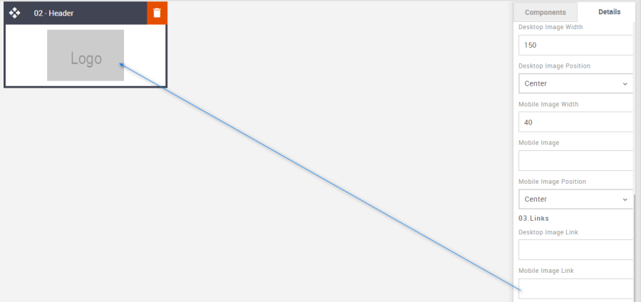
Mobile Image Link: Used to set the image link for mobile. Perhaps for a mobile-friendly website version. Equally, it can be the same as the desktop version.
Option
Details
Default
Links
Mobile Image link
Blank
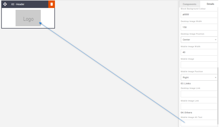
ALT Text: The ALT attribute provides alternative information for an image if a user for some reason cannot view images (because of a slow connection, or their default setting is set to not display images, it is also useful for those with a visual impairment whereby narration software will read out the image name or description). As this is a logo image then a brand name is desirable.
Option
Details
Default
Alt text
Mobile Image Alt Text
Blank
Mobile Header Logo Width: Used to set the desktop logo width for mobile if a separate mobile version has not been applied. This setting is in the Advanced Tab.
Option
Details
Default
Logo Width
Mobile Header Logo Width
80
Compatibility:
There are no known render issues with this block
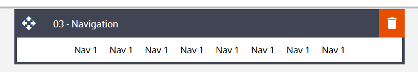
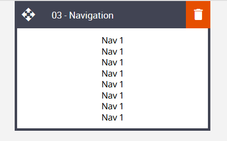
03 – Navigation
Description:
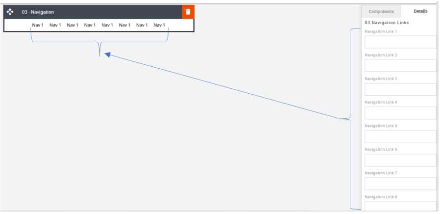
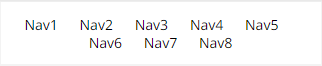
This navigation block, also known interchangeably as a menu, can have up to eight editable links. This includes the usual text formatting such as Colors, and general styling. Plus, the option to stack the content in two rows in mobile view – depending on the number of navigation links chosen.
Default block view:
Desktop | Mobile |
|---|---|
|
|
Formatting options:
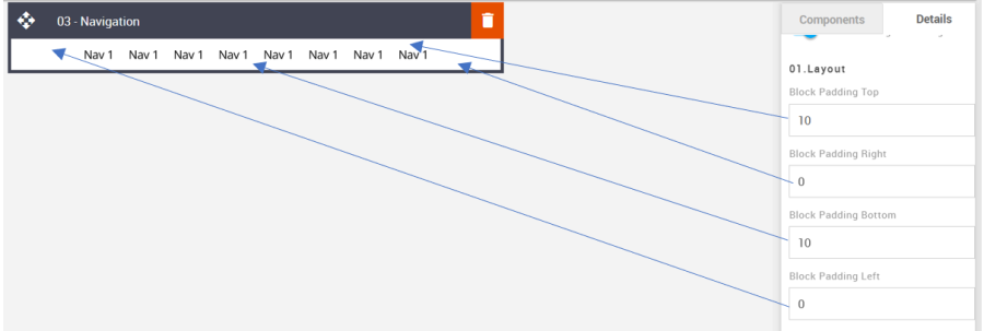
Padding: This refers to the space between the content of the block and its border. This can be edited in the Details Tab.
Option
Details
Default
Padding
Top
10
Right
0
Bottom
10
Left
0
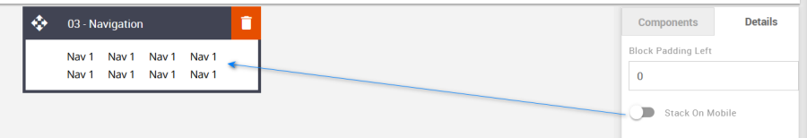
Stack On Mobile: It allows you to display navigation text into two rows in mobile view.
Option
Details
Default
Stack On Mobile
Navigation Text Stack
Hide
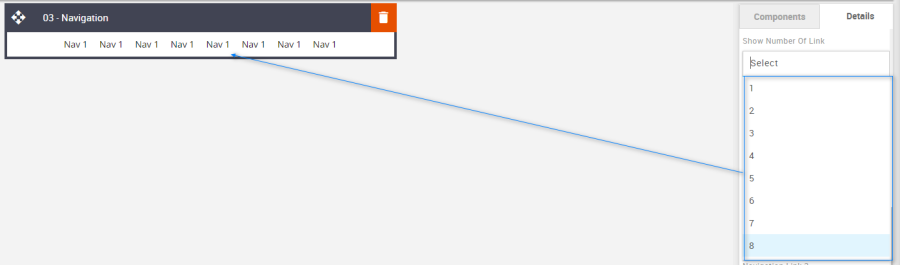
Show Number of Links: Used to change the number of required Navigation links.
Option
Details
Default
Show Number of Links
1
8
2
3
4
5
6
7
8
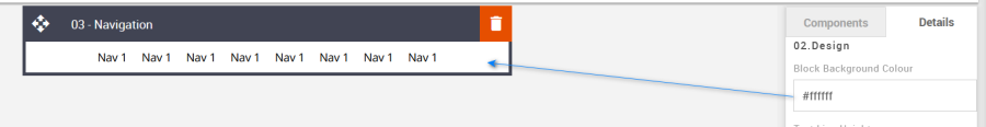
Block Background Color: Used to change the block background color. Only use HEX color values. HTML email only recognizes 6-digit long-hand versions and has patchy support for shorthand versions.
Option
Details
Default
Background Color
Block Background Color
#ffffff
Navigation Text Color: Used to change the navigation text color.
Option
Details
Default
Navigation Text Color
Navigation Text
#000000
Line Height: Used to change the line height of the text.

As with all text, please be sure the minimum line height value is not less than 4px higher than the font size. For example, if the font size is 18px, the line height should not exceed 22px.
Option
Details
Default
Line Height
Navigation Text
18
Links: Add the navigation links to the link fields.
Option
Details
Default
Links
Link 1
Blank
Link 2
Blank
Link 3
Blank
Link 4
Blank
Link 5
Blank
Link 6
Blank
Link 7
Blank
Link 8
Blank
Compatibility:
There are no known render issues with this block.
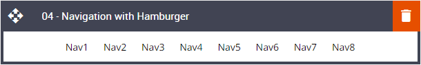
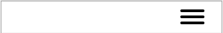
04 – Navigation with Hamburger
Description:
The Hamburger-style navigation has been around for several years but isn't fully compliant. In essence, it looks the same as the standard navigation mentioned above in desktop view, but for mobile, it offers three horizontal lines, resembling a hamburger (which is where the name came from). Where devices are incompatible the standard style navigation will replace the hamburger.
Default block view:
Desktop | Mobile |
|---|---|
|
|
Formatting options:
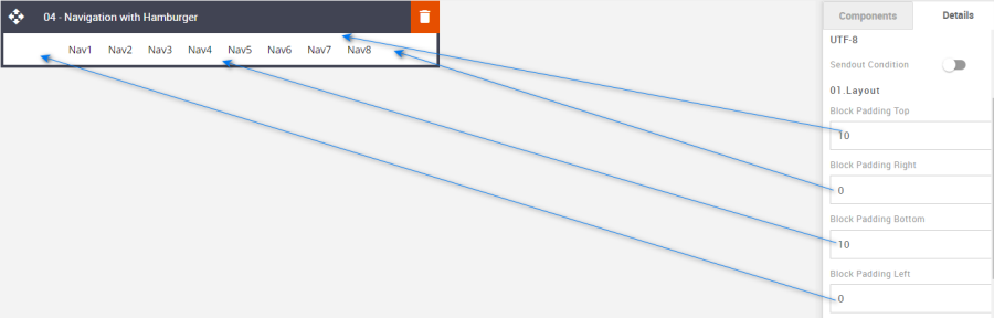
Padding: This refers to the space between the content of the block and its border. This can be edited in the Details Tab.
Option
Details
Default
Padding
Top
10
Right
0
Bottom
10
Left
0
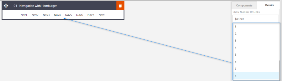
Show Number of Links: Used to change the number of Navigation links required.
Option
Details
Default
Show Number of Links
1
8
2
3
4
5
6
7
8
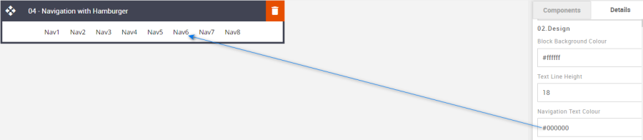
Block Background Color: Used to change the block background color. Only use HEX color values. HTML email only recognizes 6-digit long-hand versions and has patchy support for shorthand versions.
Option
Details
Default
Background Color
Block Background Color
#ffffff
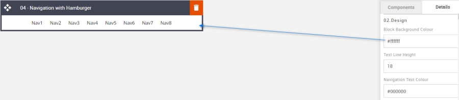
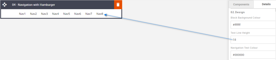
Line Height: Used to change the text line height.
As with all text, please be sure the minimum line height value is not less than 4px higher than the font size. For example, if the font size is 18px, the line height should not exceed 22px.
Option
Details
Default
Line Height
Text
18
Navigation Text Color: Used to change the navigation text color.
Option
Details
Default
Navigation Text Color
Navigation Text
#000000
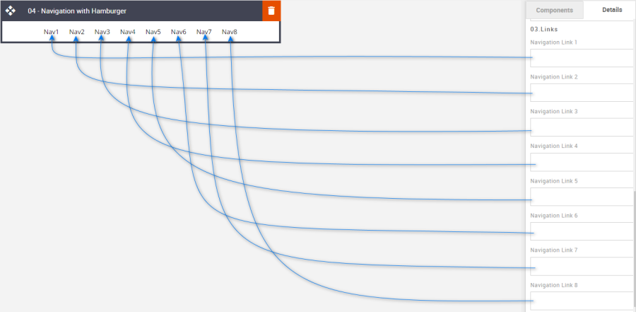
Links: Used to enter each navigation's respective external link.
Option
Details
Default
Links
Nav1
Blank
Nav2
Blank
Nav3
Blank
Nav4
Blank
Nav5
Blank
Nav6
Blank
Nav7
Blank
Nav8
Blank
Compatibility:
For those devices that are incompatible the standard navigation will display.
Interactive view:
Desktop | Mobile |
|---|---|
|
|

Fallback view:
Desktop | Mobile |
|---|---|
|
|
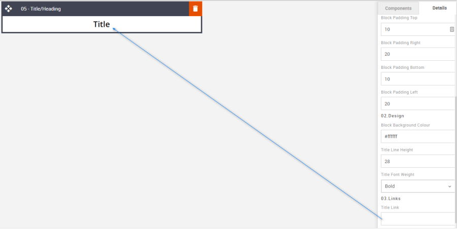
05 – Title or Heading
Description:
This simple title/heading block offers the usual styling options as well as text alignment but with the additional option to add a link to the text. Some previous blocks have this feature, but it wasn't as standard.
Default block view:
Desktop | Mobile |
|---|---|
|
|
Formatting options:
Padding: This refers to the space between the content of the block and its border. This can be edited in the Details Tab.
Option
Details
Default
Padding
Top
10
Right
20
Bottom
10
Left
20
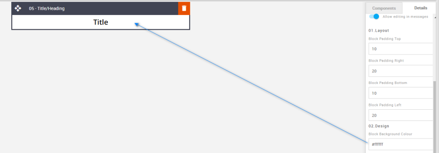
Block Background Color: Used to change the block background color. Only use HEX color values. HTML email only recognizes 6-digit long-hand versions and has patchy support for shorthand versions.
Option
Details
Default
Background Color
Block Background Color
#ffffff
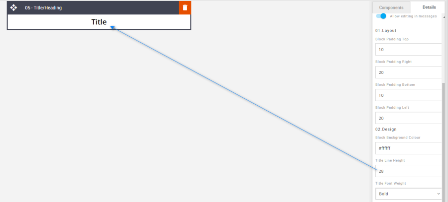
Line Height: Used to change the text line height.
As with all text, please be sure the minimum line height value is not less than 4px higher than the font size. For example, if the font size is 18px, the line height should not exceed 22px.Option
Details
Default
Title Line Height
Title
28
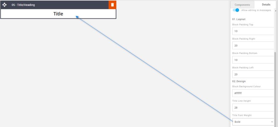
Font Weight: Used to change the font-weight – bold or normal.
Option
Details
Dropdown
Default
Title Font Weight
Title
Bold/Normal
Bold
Links: This option can be used to add an external link to the Title text.
Option
Details
Default
Title Link
Title
Blank
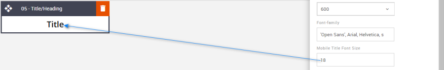
Mobile Title Font Size: The mobile font size can be set using the Advanced Tab.
Option
Details
Default
Font Size
Mobile Title font size
18
Compatibility:
There are no known render issues with this block.
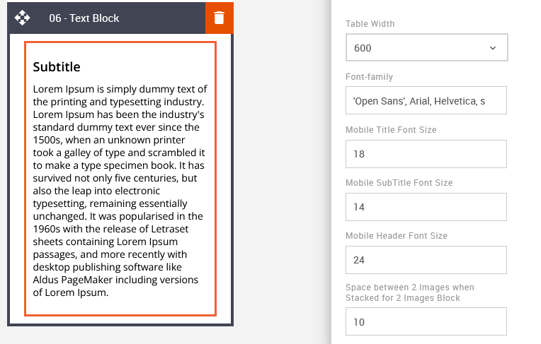
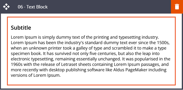
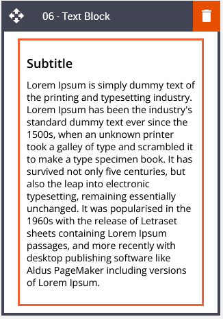
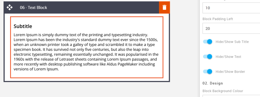
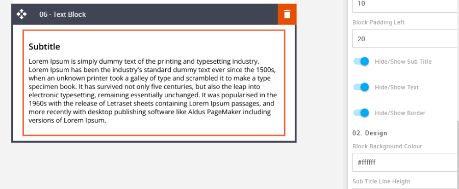
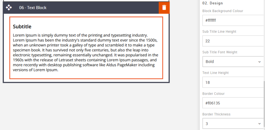
06 – Text Block
Description:
There are options to hide/show the different elements within the block – Subtitle & text area. The extra option here is the feature to hide/show a keyline border and edit its styling. Keylines around text can draw the eye in, giving the client greater design options for their marketing messages, away from the usual heading/text block.
Default block view:
Desktop | Mobile |
|---|---|
|
|
Formatting options:
Padding: This refers to the space between the content of the block and its border. This can be edited in the Details Tab.
Option
Details
Default
Padding
Top
10
Right
20
Bottom
10
Left
20
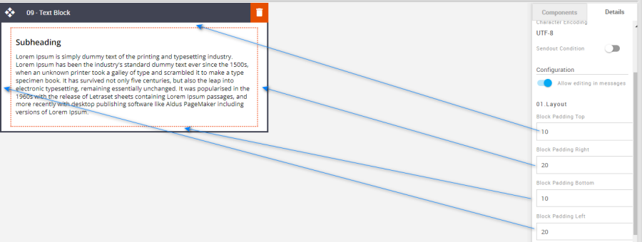
Hide/Show : Used to hide or show elements like Subtitles, text, or borders.
Option
Details
Default
Hide/Show
Subtitle
Show
Text
Show
Border
Hide
Block Background Color: Used to change the block background color. Only use HEX color values. HTML email only recognizes 6-digit long-hand versions and has patchy support for shorthand versions.
Option
Details
Default
Background Color
Block Background Color
#ffffff
Line Height: Used to change the text line height.
As with all text, please be sure the minimum line height value is not less than 4px higher than the font size. For example, if the font size is 18px, the line height should not exceed 22px.
Option
Details
Default
Line Height
Subtitle
22
Text
18
Font Weight: It allows you to change the weight of the font of the "Subheading".
Option
Details
Dropdown
Default
Font Weight
Subheading
Bold/Normal
Bold
Border Color: Used to change the border color. There is also an option to change the border thickness.
Option
Details
Default
Border Color
Border Color
#f06135
Border Thickness
Border Thickness
3
Mobile Subtitle Font Size: The mobile font size can be set using the Advanced Tab.
Option
Details
Default
Font Size
Mobile Subtitle Font Size
14
Compatibility:
There are no known render issues with this block.
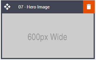
07 – Hero Image
Description:
We all know the Hero block well and sometimes we take it for granted. The hero usually fills the opening screen and previously had few options other than bespoke builds. This block can now have a border and render smaller. Another added benefit is the option to add an independent mobile-size image. Previously if a landscape image was used for desktop this rendered oddly when responding down into mobile view. If the hero is swapped for a 'squarer' image for mobile the viewing experience is greater.
Default block view:
Desktop | Mobile |
|---|---|
|
|
Formatting options:
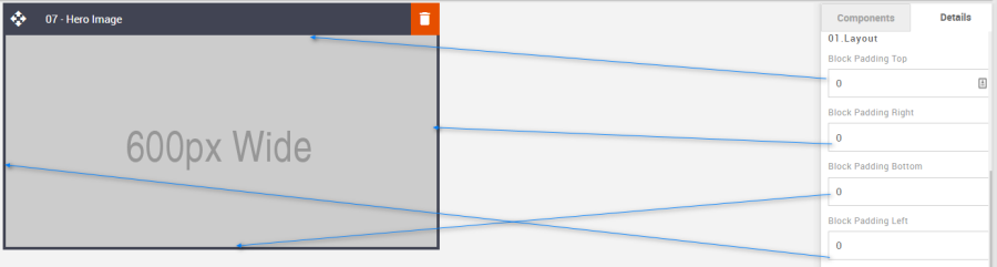
Padding: This refers to the space between the content of the block and its border. This can be edited in the Details Tab.
Option
Details
Default
Padding
Top
0
Right
0
Bottom
0
Left
0
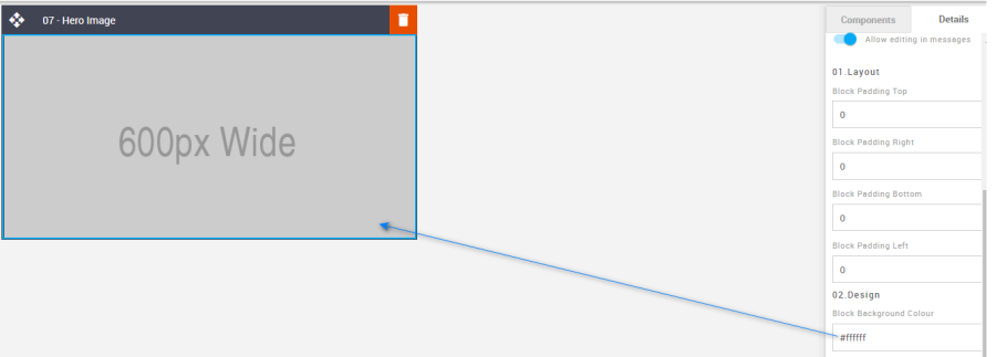
Block Background Color: Used to change the block background color. Only use HEX color values. HTML email only recognizes 6-digit long-hand versions and has patchy support for shorthand versions.
Option
Details
Default
Background Color
Block Background Color
#ffffff
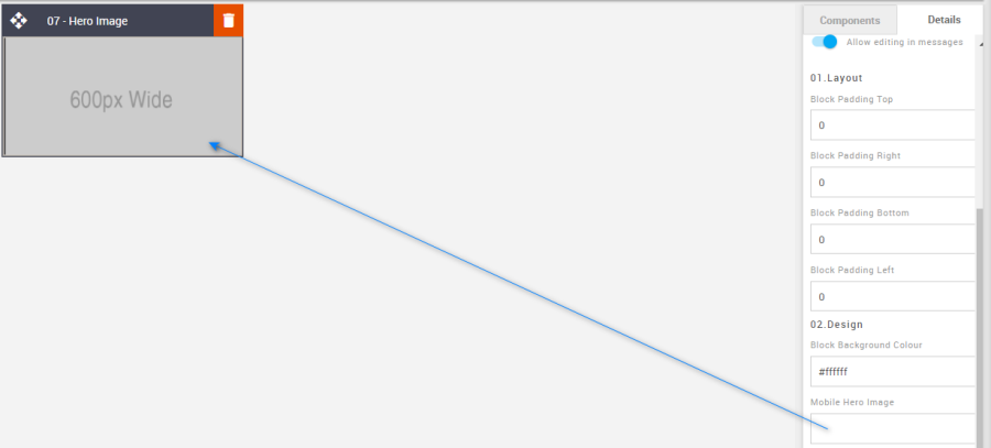
Mobile Hero Image: Used to set an independent image for mobile view. First, upload the image to the Content Store and then apply the image URL to the input field in the Details Tab.
Option
Details
Default
Hero Image
Mobile Image
Blank
Desktop Hero Image Link: Used to add the desktop view image link.
Option
Details
Default
Image Link
Desktop Hero Image Link
Blank
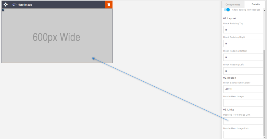
Mobile Hero Image Link: Used to add the mobile view image link.
Option
Details
Default
Image Link
Mobile Hero Image Link
Blank
Compatibility:
There are no known render issues with this block.
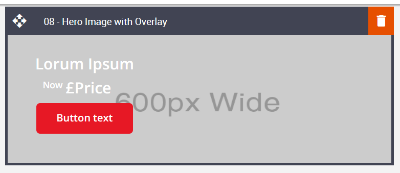
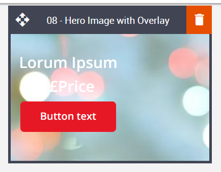
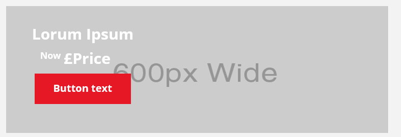
08 – Hero Image with Overlay
Description:
An image block with overlaid elements such as a heading, text area, and button can be hidden or shown. The contained image is coded as a background image to overlay these elements, which limits what can be done with the image for some email clients. As with the Hero block, uploading a mobile-friendly-sized image is recommended. This block is incompatible because the button cannot render rounded corners in some email clients.
Default block view:
Desktop | Mobile |
|---|---|
|
|
Formatting options:
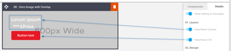
Hide/Show: Used to hide or show the Content or CTA.
Option
Details
Default
Hide/Show
Content
Show
CTA
Show
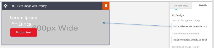
Desktop Background Image: Used to change the desktop background images in the block.
Option
Details
Default
Background Image
Desktop Background Image
https://amundsen.shortest-route.com/cts-demo/imgproxy/img/2040341002/600x295.png?text=Desktop
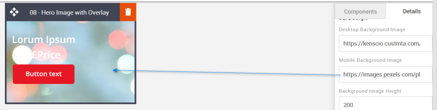
Mobile Background Image: Used to change the mobile background images in the block.
Option
Details
Default
Background Image
Mobile Background Image
https://amundsen.shortest-route.com/cts-demo/imgproxy/img/2040341186/bubbles_placeholder.png
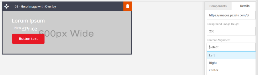
Content Position: This option can be selected via the drop-down in the Details tab and is used to align the block content.
Option
Dropdown
Default
Content Position
Left
Left
Centre
Right
Font Weight: Used to change the weight of the font. Each element is independent of one another.
Option
Details
Dropdown
Default
Font Weight
Title
Bold/Normal
Bold
Text
Bold
Price
Bold
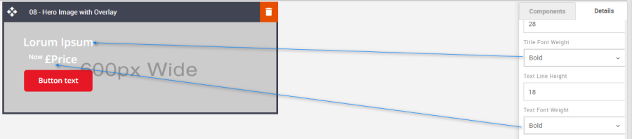
Line Height: Used to change the text line height.
As with all text, please be sure the minimum line height value is not less than 4px higher than the font size. For example, if the font size is 18px, the line height should not exceed 22px.
Option
Details
Default
Line Height
Title
28
Text
18
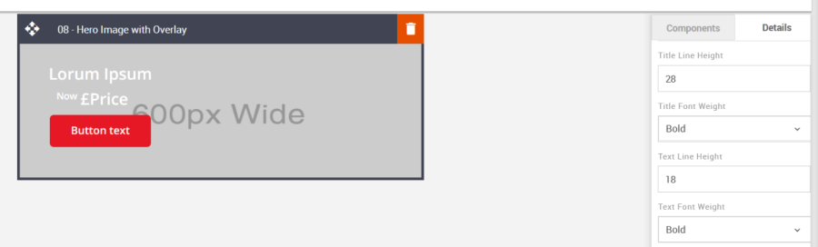
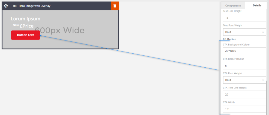
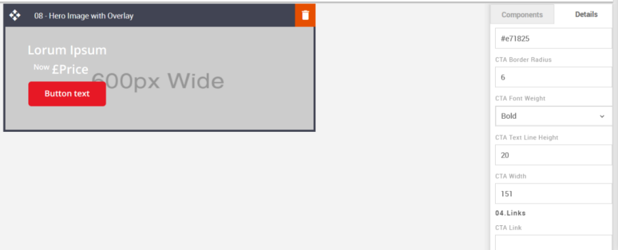
CTA: All CTA's have multiple styling options. As with all Colors please use HEX values.
Option
Details
Default
CTA
Background Color
#e71825
Border radius
6
Font weight
Bold
CTA Text Line Height
20
CTA width
151
Links: It allows you to add the link to the image and CTA button.
Option
Details
Default
Link
CTA Link
Blank
Mobile Title Font Size: Used to set the font size for mobile view. It allows you to update the title's font size in mobile view. This will need to be updated using the option in Advanced Tab.
Option
Details
Default
Font Size
Mobile Title Font Size
18
Compatibility:
CTA's with curved corners will not display as curved when they are placed on top of a background image. When images are configured as background images, this limits the type of functionality that can be applied to the image and anything it is overlaid with. This is industry-wide.
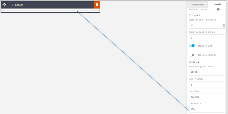
09 – Spacer
Description:
The simple Spacer block. It may be simple, but it is one of the most important features of any email. Every design relies on 'space', no matter the industry. The added feature in this block is the additional function to hide/show a keyline or just render it in desktop view. As well as edit the thickness and color and set the widths on desktop and mobile using a percentage.
Default block view:
Desktop | Mobile |
|---|---|
|
|
Formatting options:
Padding: This refers to the space between the content of the block and its border. This can be edited in the Details Tab.
Option
Details
Default
Padding
Top & Bottom
10
Left & Right
0
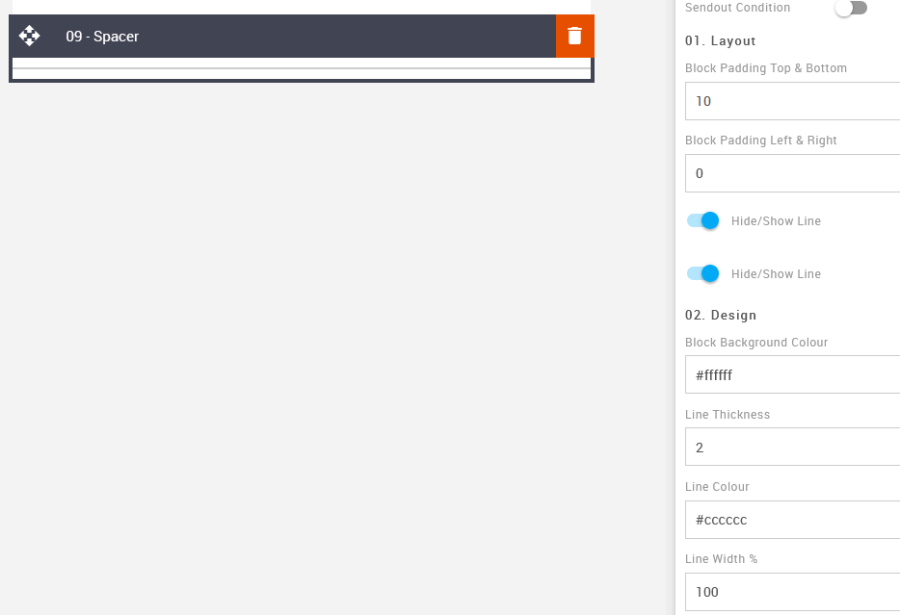
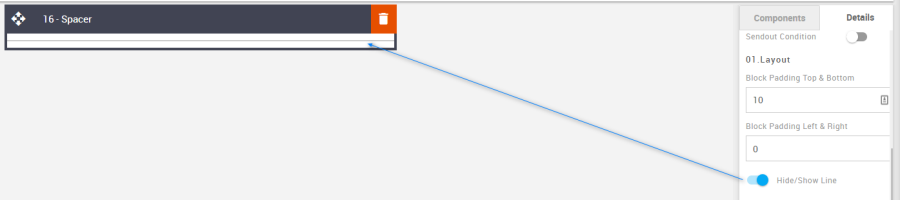
Hide/Show Line: Used to set the hide and show options for desktop and mobile.
Option
Details
Default
Hide/Show
Desktop
Show
Mobile
Hide
Block Background Color: Used to change the block background color. Only use HEX color values. HTML email only recognizes 6-digit long-hand versions and has patchy support for shorthand versions.
Option
Details
Default
Background Color
Block Background Color
#ffffff
Line Thickness: It allows you to change the thickness of the spacer.
Option
Details
Default
Line Thickness
Line Thickness
2
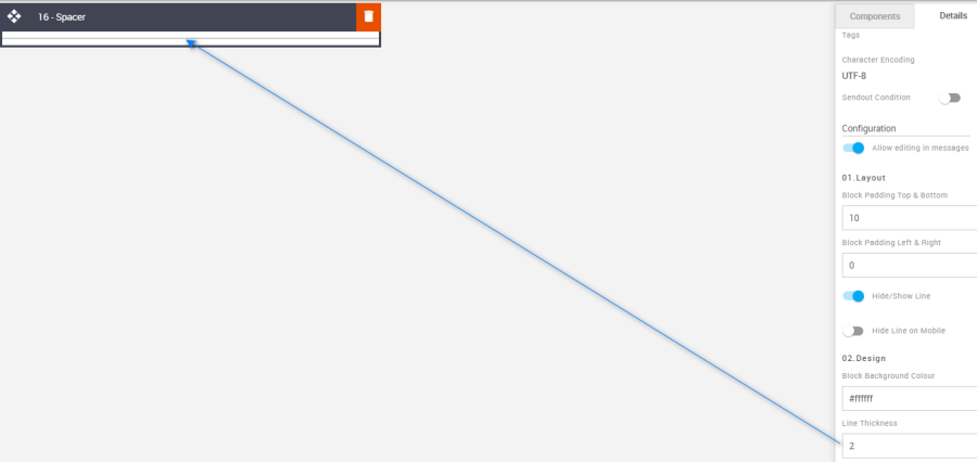
Line Color: It allows you to change the color of the spacer.
Option
Details
Default
Line Color
Line Color
#cccccc
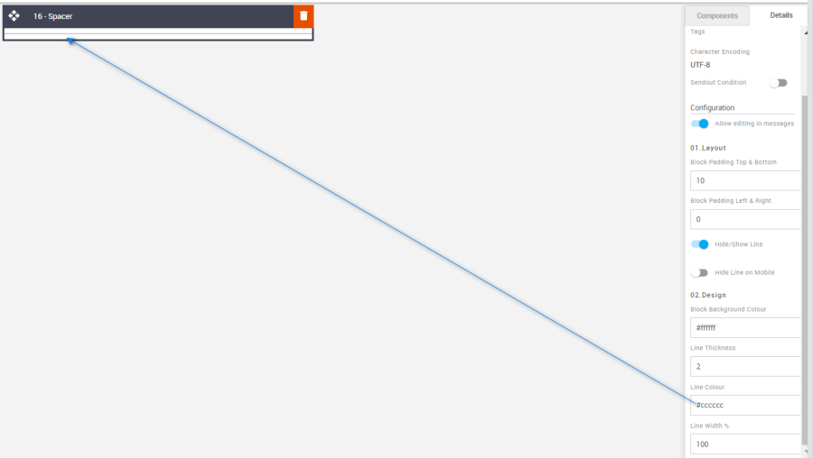
Line Width %: It allows you to change the width of the spacer in % level.
Option
Details
Default
Line Width %
Line Width %
100
Compatibility:
There are no known render issues with this block.
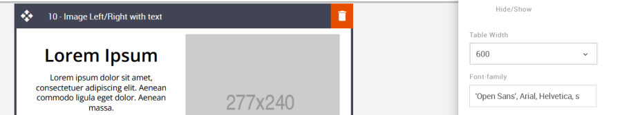
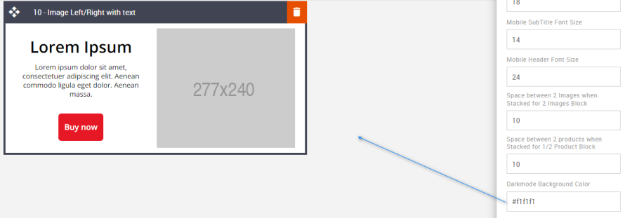
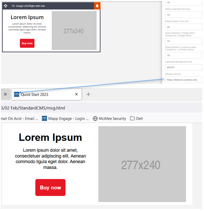
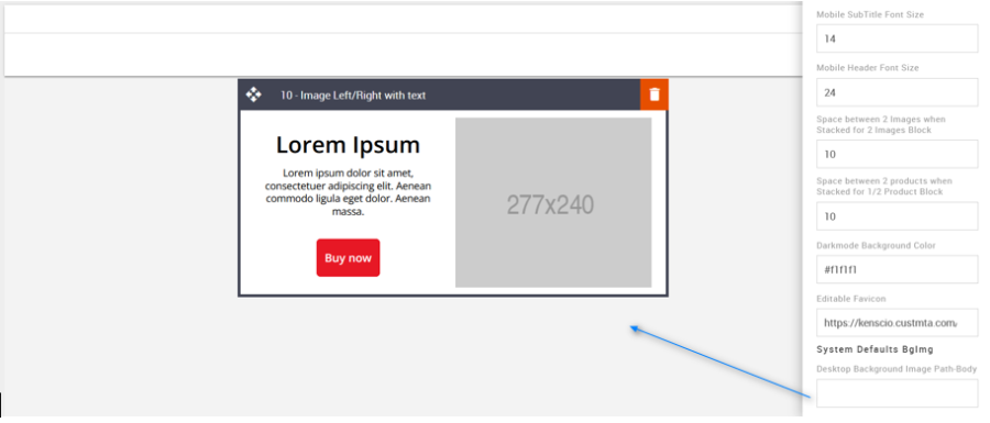
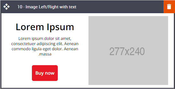
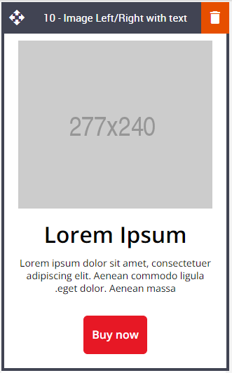
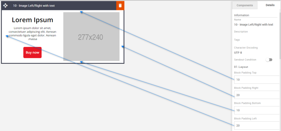
10 – Image Left/Right with text
Description:
A 50/50 width split view between an image and text area with the option to swap the image or text to the left or right sides. All the elements are editable - title, text area, and button. These can also be hidden or shown independently of one another. No matter which side the image is in desktop view the image will always render above the text in mobile view.
Default block view:
Desktop | Mobile |
|---|---|
|
|
Formatting options:
Padding: This refers to the space between the content of the block and its border. This can be edited in the Details Tab.
Option
Details
Default
Padding
Top
10
Right
20
Bottom
10
Left
20
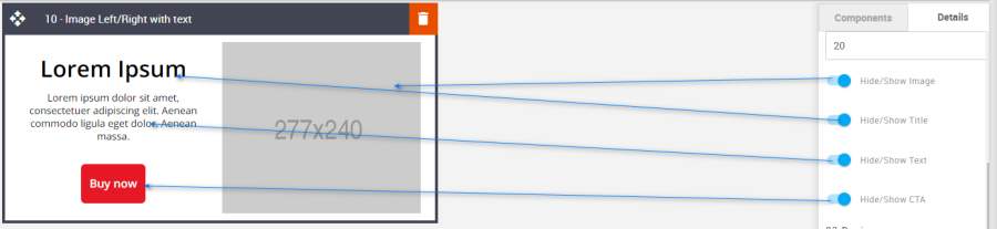
Hide/Show: Use the toggles to hide or show all the different elements.
Option
Details
Default
Hide/Show
Image
Show
Title
Text
CTA
Block Background Color: Used to change the block background color. Only use HEX color values. HTML email only recognizes 6-digit long-hand versions and has patchy support for shorthand versions.
Option
Details
Default
Background Color
Block Background Color
#ffffff
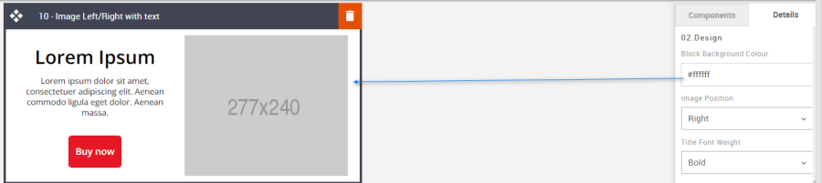
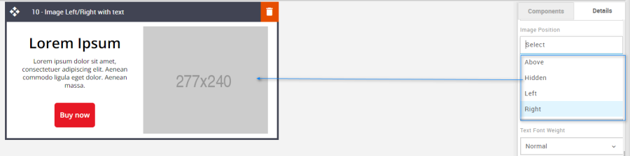
Image Position: Use the drop-down selection to align the block content.
Option
Dropdown
Default
Image Position
Above
Right
Hidden
Left
Right
Font Weight: Used to independently set the font weight for both text elements – Bold or normal.
Option
Details
Dropdown
Default
Font Weight
Title
Bold/Normal
Bold
Text
Normal
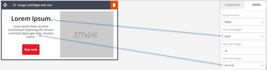
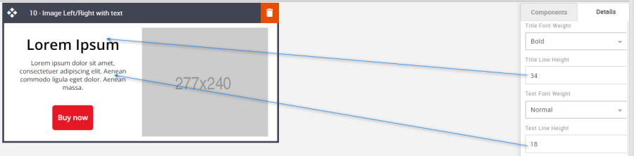
Line Height: Used to change the text line height.
As with all text, please be sure the minimum line height value is not less than 4px higher than the font size. For example, if the font size is 18px, the line height should not exceed 22px.
Option
Details
Default
Line Height
Title
34
Text
18
CTA: All CTA's have multiple styling options. As with all colors please use HEX values.
Option
Details
Default
CTA
Background Color
#e71825
Text Color
#ffffff
Font weight
Bold
Border radius
6
Border width
1
Border Color
#e71825
Height
52
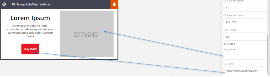
Links: Links can be added to both the image and the CTA.
Option
Details
Default
Links
Image
Blank
CTA
https://www.example.com
Compatibility:
Currently, the CTA button curved border does not render in the devices listed below. Instead, the corners will be square.
GMX Chrome Windows 10
GMX Edge Windows 10
GMX Firefox Windows 10
Web.de Chrome Windows 10
Web.de Edge Windows 10
Web.de Firefox Windows 10
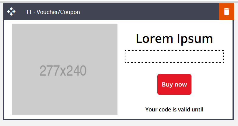
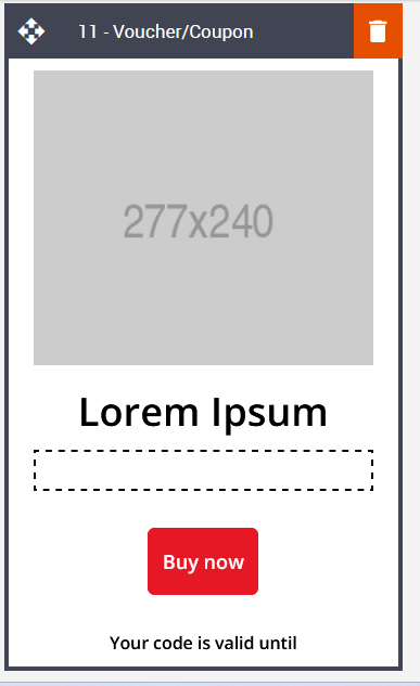
11 – Voucher/Coupon
Description:
This block has the same features as block 10 but with the added option of including a voucher code or discount code in conjunction with uploading coupon codes to Engage or a single manual generic code. A 50/50 split between image and text with the option to swap the content left or right. Editable image, title, Voucher/Coupon Code, CTA. All these elements also have the option to Hide or Show.
Default block view:
Desktop | Mobile |
|---|---|
|
|
Formatting options:
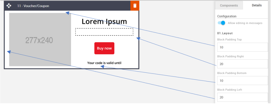
Padding: This refers to the space between the content of the block and its border. This can be edited in the Details Tab.
Option
Details
Default
Padding
Top
10
Right
20
Bottom
10
Left
20
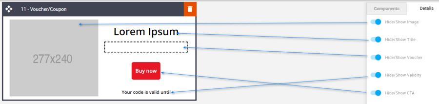
Hide/Show: Use the toggles to hide or show all the different elements.
Option
Details
Default
Hide/Show
Image
Show
Title
Show
Voucher
Show
Validity
Show
CTA
Show
Block Background Color: Used to change the block background color. Only use HEX color values. HTML email only recognizes 6-digit long-hand versions and has patchy support for shorthand versions.
Option
Details
Default
Background Color
Block Background Color
#ffffff
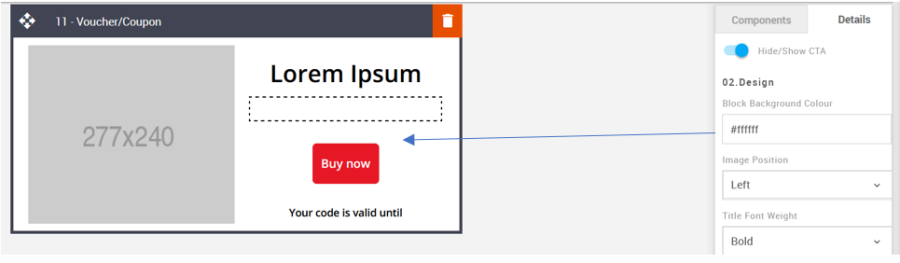
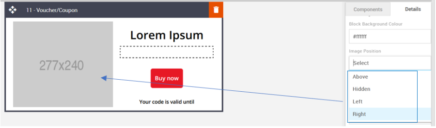
Image Position: There are multiple alignment options all of which can be found in the drop-down menu.
Option
Dropdown
Default
Image Position
Above
Left
Hidden
Left
Right
Font Weight: Set the weight of each text element independently.
Option
Details
Dropdown
Default
Font Weight
Title
Bold/Normal
Bold
Voucher
Bold
Validity
Bold
Line Height: Used to change the text line height.
As with all text, please be sure the minimum line height value is not less than 4px higher than the font size. For example, if the font size is 18px, the line height should not exceed 22px.
Option
Details
Default
Line Height
Title
34
Voucher
18
Validity
18
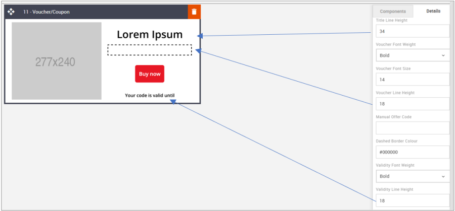
Manual Offer Code: This is used to manually set an offer code. Enter the code into the code field.
Option
Details
Default
Voucher Offer Code
Voucher Manual Offer Code
Blank
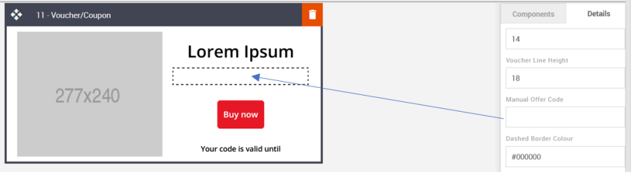
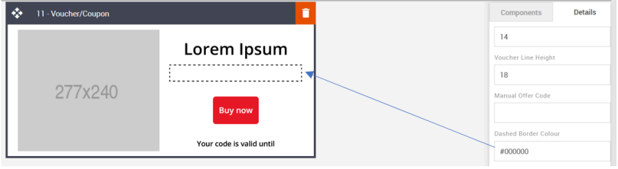
Dashed Border Color: The dashed border color can be changed, but please be sure to use a 6-digit HEX value.
Option
Details
Default
Voucher Border Color
Voucher Dashed Border Color
#000000
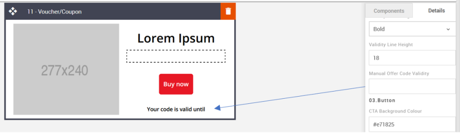
Manual Offer Code Validity: Enter some text to inform recipients of when the code or voucher is due to expire.
Option
Details
Default
Offer Validity
Manual Offer Code Validity
Blank
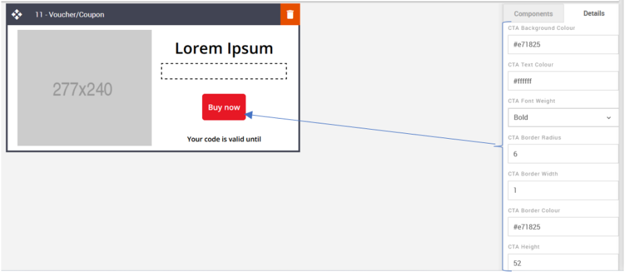
CTA: It allows you to format the CTA button as required. Details are below. It takes the hexacode of the color as the value to change the color wherever applicable.
Option
Details
Default
CTA
Background Color
#e71825
Text Color
#ffffff
Font weight
Bold
Border radius
6
Border width
1
Border Color
#e71825
Height
52
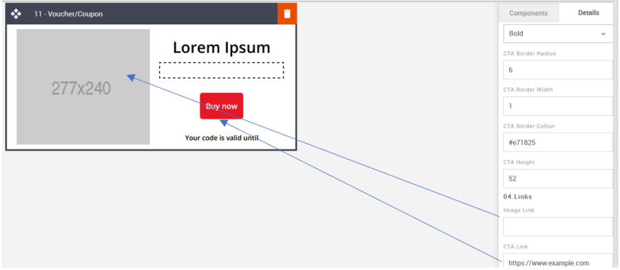
Links: Add links to the image and CTA.
Option
Details
Default
Links
Image
Blank
CTA
https://www.example.com
Mobile Header Font Size: The mobile font size can be set using the Advanced Tab.
Option
Details
Default
Font Size
Mobile Header Font Size
24
Compatibility:
Currently, the CTA button curved border does not render in the devices listed below. Instead, the corners will be square.
GMX Chrome Windows 10
GMX Edge Windows 10
GMX Firefox Windows 10
Web.de Chrome Windows 10
Web.de Edge Windows 10
Web.de Firefox Windows 10
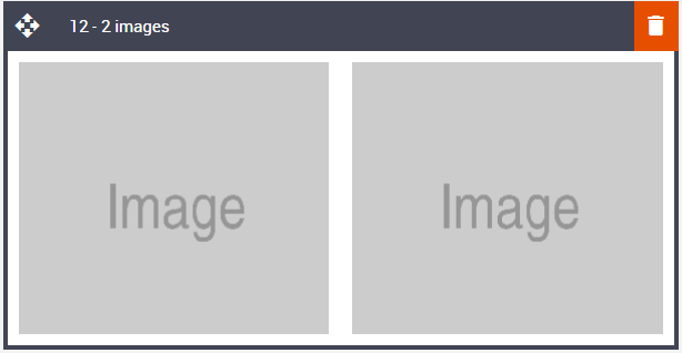
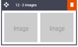
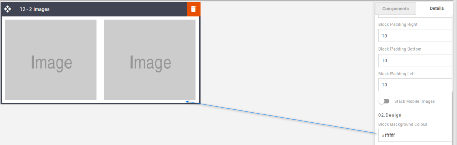
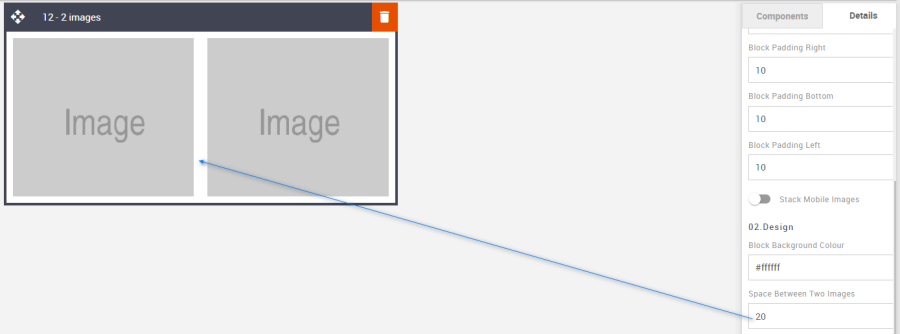
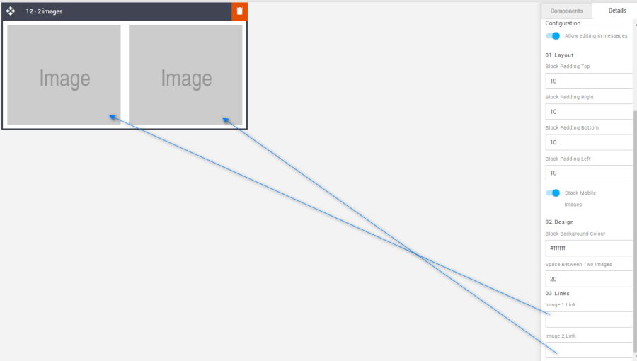
12 – 2 images
Description:
Two images side by side on desktop and mobile and the option to stack them on mobile. This block has no other elements such as text. It is just image-based but nonetheless extremely useful. Basic 2 image block can stack or sit side-by-side on mobile using a toggle. Images and links are editable.
Default block view:
Desktop | Mobile |
|---|---|
|
|
Formatting options:
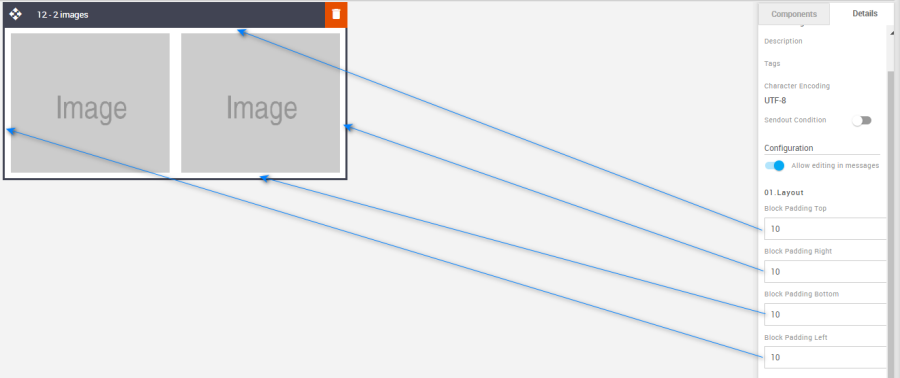
Padding: This refers to the space between the content of the block and its border. This can be edited in the Details Tab.
Option
Details
Default
Padding
Top
10
Right
10
Bottom
10
Left
10
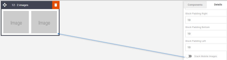
Stack Mobile Images: Use the toggle to set the image to stack in the mobile view or leave them side by side like the desktop view.
Option
Details
Default
Mobile Images
Stack Mobile Images
Hide
Block Background Color: Used to change the block background color. Only use HEX color values. HTML email only recognizes 6-digit long-hand versions and has patchy support for shorthand versions.
Option
Details
Default
Background Color
Block Background Color
#ffffff
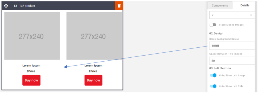
Space between Two Images: Chose to increase or decrease the space between the two images when they are side by side in desktop view.
Option
Details
Default
Space between Two Images
Space between two images
#ffffff
Links: Add links to the images via the fields in the Details Tab.
Option
Details
Default
Links
Image 1 Link
Blank
Image 2 Link
Blank
Space between two Images: To increase or decrease the spacing between the images when stacking edit the option in the Advanced Tab.
Option
Details
Default
Space between two images
Mobile Space between 2 images
10
Compatibility:
There are no known render issues with this block.
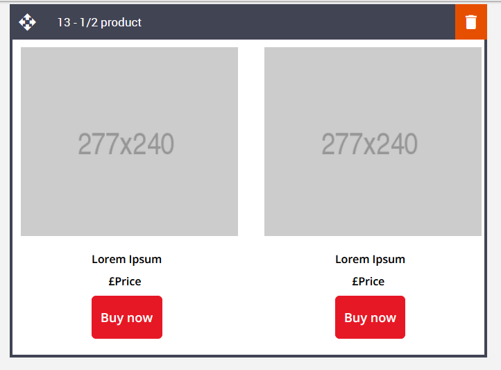
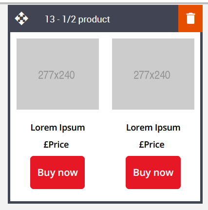
13 – 1 or 2 Products
Description:
This block can display 1 or 2 products with text and a button under each image tile. All of the elements can be hidden or shown and are fully editable. The text areas consist of an item title or description, price, and button. Of course, the price element is not fixed and can be used for any text-based purpose. Images can be side by side in desktop and mobile view as well as stacked in mobile.
Default block view:
Desktop | Mobile |
|---|---|
|
|
Formatting options:
Padding: This refers to the space between the content of the block and its border. This can be edited in the Details Tab.
Option
Details
Default
Padding
Top
10
Right
10
Bottom
10
Left
10
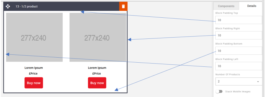
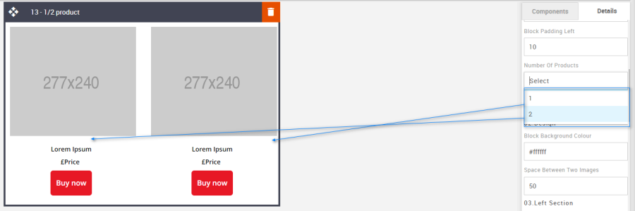
Number of Products: Use the drop-down to select the number of product tiles.
Option
Details
Default
Number of Products
1
2
2
Stack Mobile Images: Changing the toggle will set the product tiles to stack in mobile or not.
Option
Details
Default
Hide/Show Stack Images
Stack Mobile Images
Show
Block Background Color: Used to change the block background color. Only use HEX color values. HTML email only recognizes 6-digit long-hand versions and has patchy support for shorthand versions.
Option
Details
Default
Background Color
Block Background Color
#ffffff
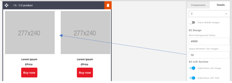
Space between Two Images: It allows you to change product spacing.
Option
Details
Default
Space
Space Between Two Images
50
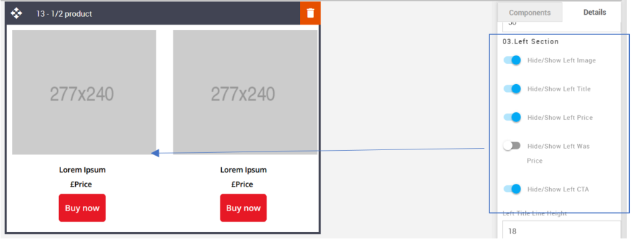
Left & Right Section - Hide/Show: Use the toggles to hide or show all the different elements. All the elements are independent of one another.
Option
Details
Default
Left Section Hide/Show
Image
Show
Title
Show
Price
Show
Was Price
Hide
CTA
Show
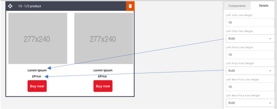
Left & Right Section - Line Height: Used to change the text line height.
As with all text, please be sure the minimum line height value is not less than 4px higher than the font size. For example, if the font size is 18px, the line height should not exceed 22px.
Option
Details
Default
Left Section Line Height
Title
18
Price
18
Was Price
18
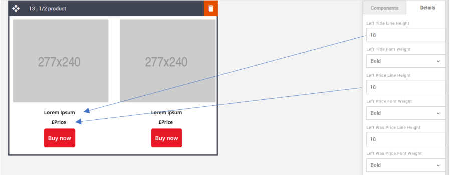
Left & Right Section - Font Weight: Used to change the font weight for the text elements. All are independent of one another.
Option
Details
Dropdown
Default
Left Section Font Weight
Title
Bold/Normal
Bold
Price
Bold
Was Price
Bold
Links: It allows you to add the link to the image and CTA button.
Option
Details
Default
Links
Left Image
Blank
Left CTA
https://www.example.com
Right Image
Blank
Right CTA
https://www.example.com
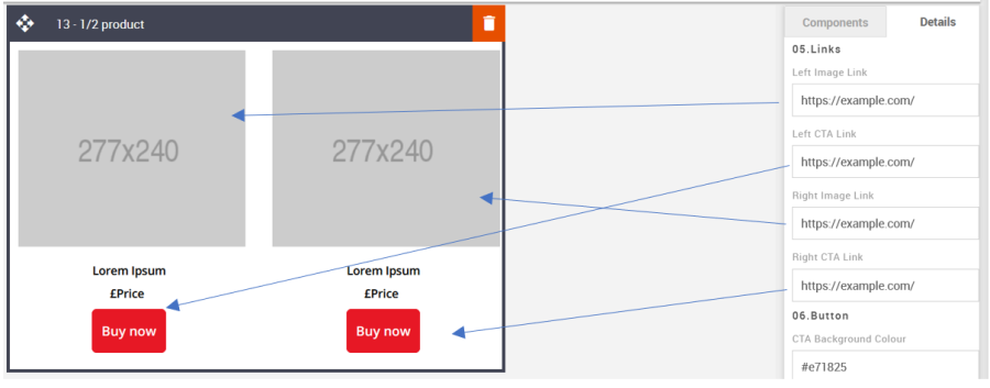
CTA: All CTA's have multiple styling options. As with all colors please use HEX values. These CTA's are not independent. Changing the setting will change styles for both CTA's.
Option
Details
Default
CTA
Background Color
#e71825
Text Color
#ffffff
Font weight
Bold
Border radius
6
Border width
1
Border Color
#e71825
Height
52
Space between two Products: This option is used to edit the space between images on mobile when stacked. This will need to be updated using the options in the Advanced tab
Option
Details
Default
Space between two Product
Space between two Products when Stacked in Mobile
10
Compatibility:
Currently, the CTA button curved border does not render in the devices listed below. Instead, the corners will be square.
GMX Chrome Windows 10
GMX Edge Windows 10
GMX Firefox Windows 10
Web.de Chrome Windows 10
Web.de Edge Windows 10
Web.de Firefox Windows 10
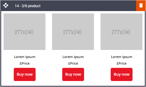
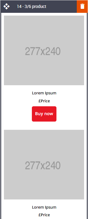
14 – 3 or 6 Products
Description:
The same as the 13 – 1 or 2 Products block, but the options are to display 3 or 6 product tiles. These can also be stacked in mobile but will stack singularly if 3 products are selected and in singles or 2's (side by side) in mobile view if 6 are selected.
Default block view:
Desktop | Mobile |
|---|---|
|
|
Formatting options:
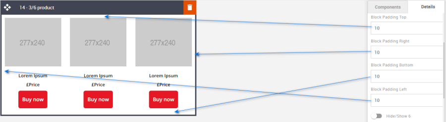
Padding: This refers to the space between the content of the block and its border. This can be edited in the Details Tab.
Option
Details
Default
Padding
Top
10
Right
10
Bottom
10
Left
10
Hide/Show 6 Products: It allows you to display or hide 6 products.
Option
Details
Default
Hide/Show
6 Products
Hide
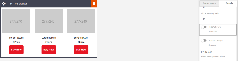
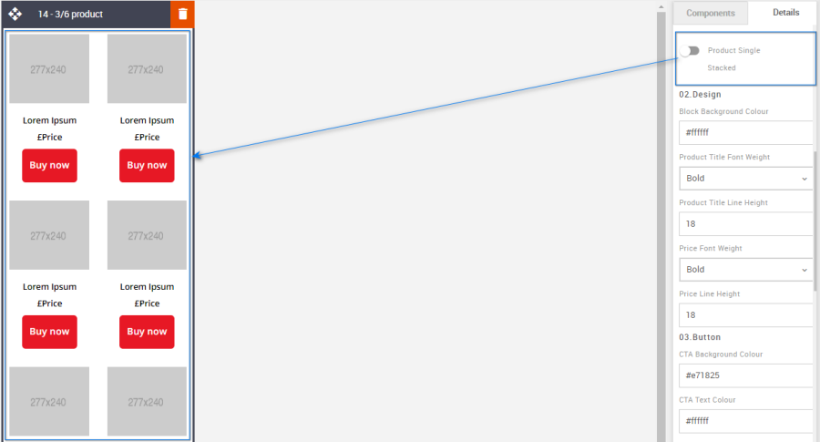
Product Single Stacked: It allows you to display or hide products like single stacked or double stacked view in the mobile view.
Option
Details
Default
Hide/Show
Product Single Stacked
Hide
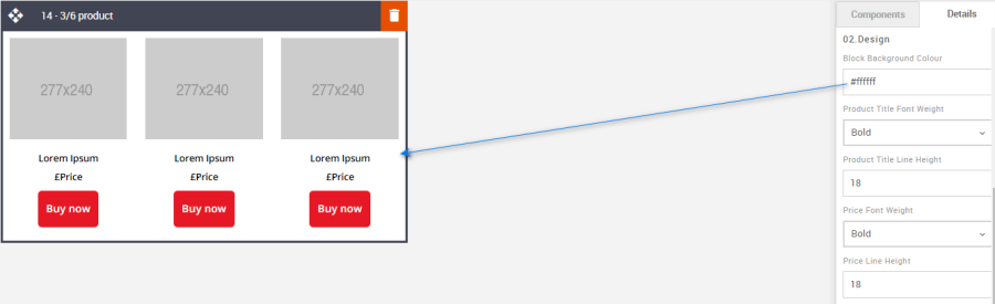
Block Background Color: Used to change the block background color. Only use HEX color values. HTML email only recognizes 6-digit long-hand versions and has patchy support for shorthand versions.
Option
Details
Default
Background Color
Block Background Color
#ffffff
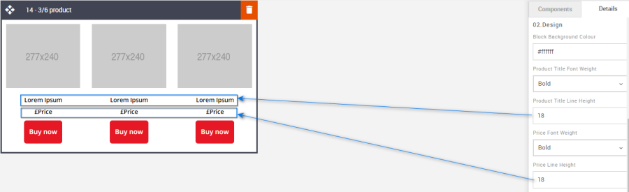
Font Weight: Used to independently change the font weight for each text element.
Option
Details
Dropdown
Default
Font Weight
Product Title
Bold/Normal
Bold
Price Text
Bold

Line Height: Used to change the text line height.
As with all tex please be sure the minimum line height value is not less than 4px higher than the font size. For example, if the font size is 18px, the line height should not exceed 22px.Option
Details
Default
Line Height
Product Title
18
Price Text
18
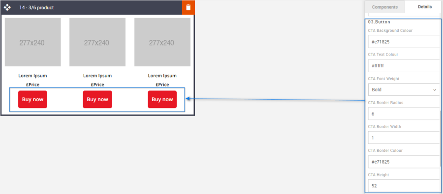
CTA: All CTA's have multiple styling options. As with all colors please use HEX values.
Option
Details
Default
CTA
Background Color
#e71825
Text Color
#ffffff
Font weight
Bold
Border radius
6
Border width
1
Border Color
#e71825
Height
52
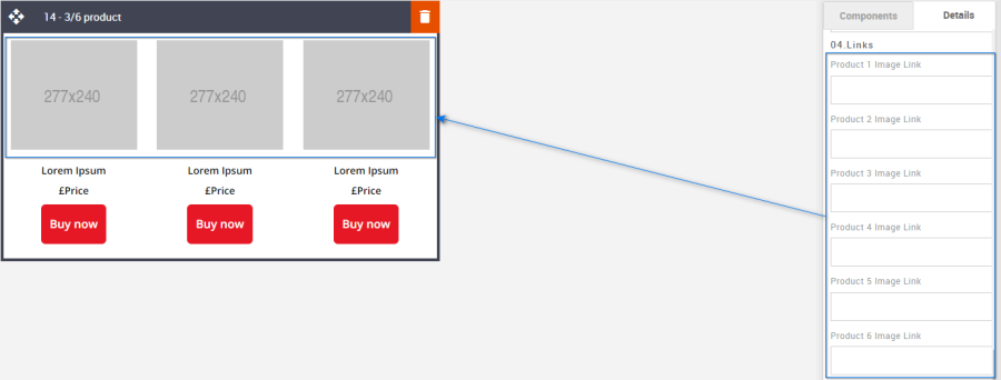
Product Image Links: Each product link will need to be applied independently.
Option
Details
Default
Links
Product 1 Image Link
Blank
Product 2 Image Link
Blank
Product 3 Image Link
Blank
Product 4 Image Link
Blank
Product 5 Image Link
Blank
Product 6 Image Link
Blank
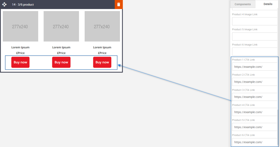
Product CTA Links: Each CTA link will need to be applied independently.
Option
Details
Default
Links
Product 1 CTA Link
Blank
Product 2 CTA Link
Blank
Product 3 CTA Link
Blank
Product 4 CTA Link
Blank
Product 5 CTA Link
Blank
Product 6 CTA Link
Blank
Compatibility:
Currently, the CTA button curved border does not render in the devices listed below. Instead, the corners will be square.
GMX Chrome Windows 10
GMX Edge Windows 10
GMX Firefox Windows 10
Web.de Chrome Windows 10
Web.de Edge Windows 10
Web.de Firefox Windows 10
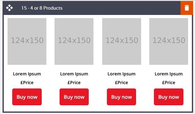
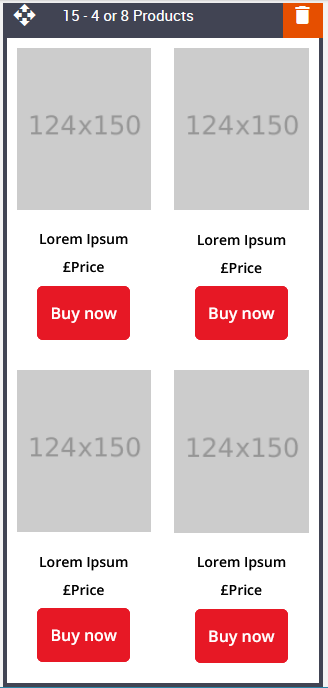
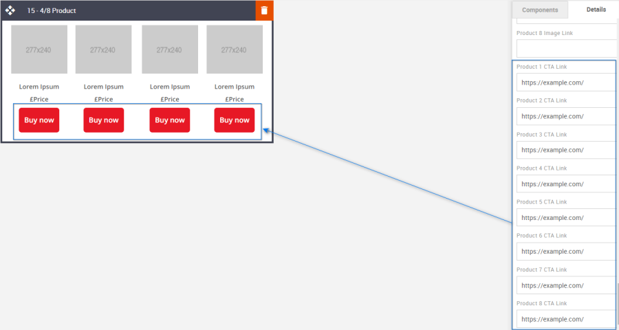
15 – 4 or 8 Product
Description:
Product block with up to 4 or 8 products with various editable parameters.
Default block view:
Desktop | Mobile |
|
|
Formatting options:
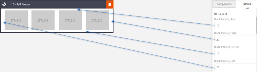
Padding: This refers to the space between the content of the block and its border. This can be edited in the Details Tab.
Option
Details
Default
Padding
Top
10
Right
20
Bottom
10
Left
20
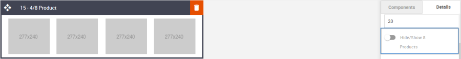
Hide/Show 8 Products: It allows you to display or hide eight products.
Option
Details
Default
Hide/Show
8 Products
Hide
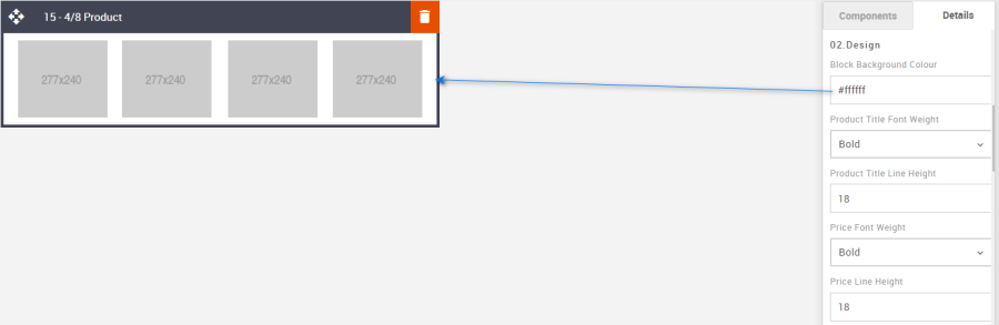
Block Background Color: It allows you to change the block's background color. It takes the hexacode of the color as the value to change the color.
Option
Details
Default
Background Color
Block Background Color
#ffffff
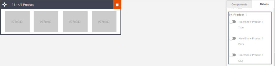
Hide/Show: It allows you to display or hide product titles, prices, and CTA.
Common settings for rest all products.Option
Details
Default
Hide/Show
Product Title
Hide
Price Text
CTA
Font Weight: It allows you to change the weight of the font of the "Product Title" and "Price text".
Option
Details
Dropdown
Default
Font Weight
Product Title
Bold/Normal
Bold
Price Text
Bold
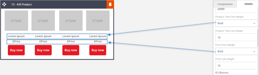
Line Height: It allows you to change the space between the line for "Product Title" and "Price text".
Please make sure that this value is at least 4px more than the font size used.
Option
Details
Default
Line Height
Product Title
18
Price Text
18
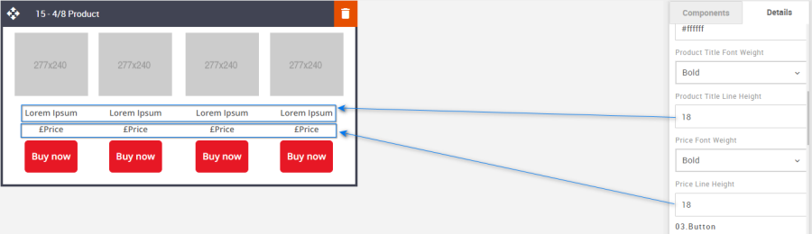
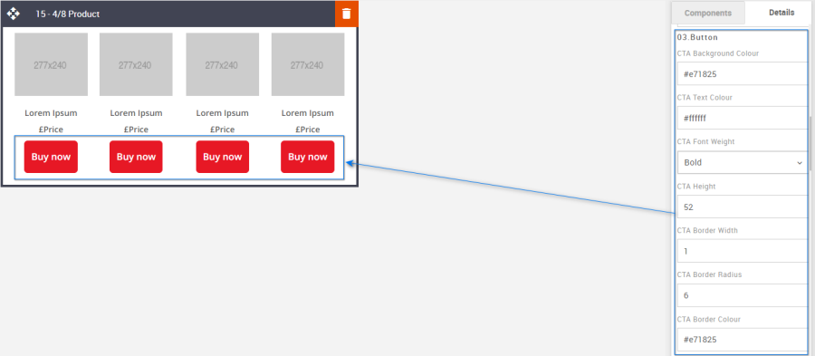
CTA: It allows you to format the CTA button as per the requirement. Details are below. It takes the hexacode of the color as the value to change the color wherever applicable.
Option
Details
Default
CTA
Background Color
#e71825
Text Color
#ffffff
Font weight
Bold
Border radius
6
Border width
1
Border Color
#e71825
Height
52
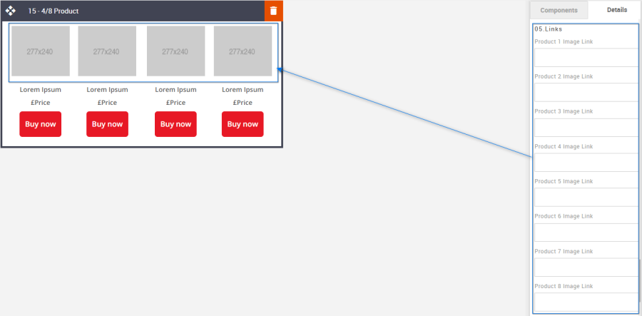
Product Image Links: It allows you to add the link to the Product images.
Option
Details
Default
Links
Product 1 Image Link
Blank
Product 2 Image Link
Blank
Product 3 Image Link
Blank
Product 4 Image Link
Blank
Product 5 Image Link
Blank
Product 6 Image Link
Blank
Product 7 Image Link
Blank
Product 8 Image Link
Blank
Product CTA Links: It allows you to add the link to the Product CTA.
Option
Details
Default
Links
Product 1 CTA Link
https://www.example.com
Product 2 CTA Link
https://www.example.com
Product 3 CTA Link
https://www.example.com
Product 4 CTA Link
https://www.example.com
Product 5 CTA Link
https://www.example.com
Product 6 CTA Link
https://www.example.com
Product 7 CTA Link
https://www.example.com
Product 8 CTA Link
https://www.example.com
Compatibility:
Currently, the CTA button curved border does not render in the devices listed below. Instead, the corners will be square.
GMX Chrome Windows 10
GMX Edge Windows 10
GMX Firefox Windows 10
Web.de Chrome Windows 10
Web.de Edge Windows 10
Web.de Firefox Windows 10
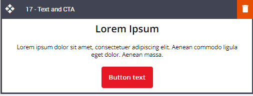
16 – Text and CTA
Description:
Simple full-width text and button block. The title, text area, and button are all editable, and there are text and button alignment options.
Default block view:
Desktop | Mobile |
|
|
Formatting options:
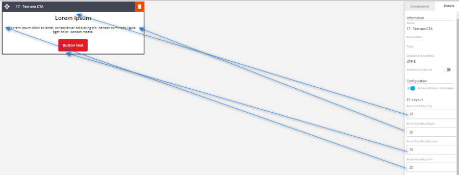
Padding: This refers to the space between the content of the block and its border. This can be edited in the Details Tab.
Option
Details
Default
Padding
Top
10
Right
20
Bottom
10
Left
20
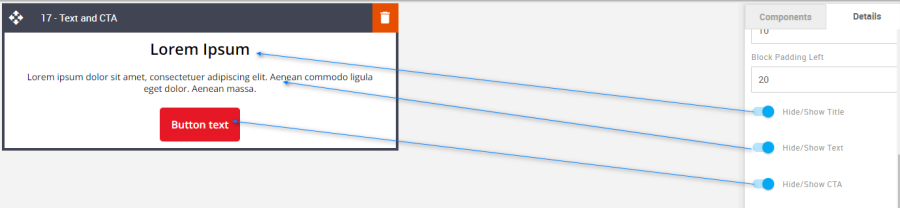
Hide/Show: Use the toggles to hide or show all the different elements.
Option
Details
Default
Hide/Show
Title
Show
Text
Show
CTA
Show
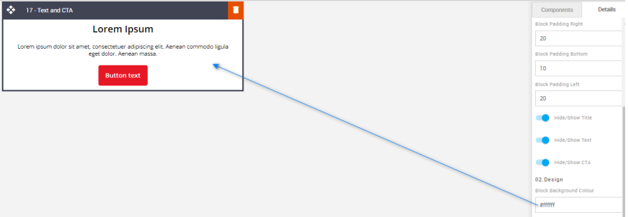
Block Background Color: Used to change the block background color. Only use HEX color values. HTML email only recognizes 6-digit long-hand versions and has patchy support for shorthand versions.
Option
Details
Default
Background Color
Block Background Color
#ffffff
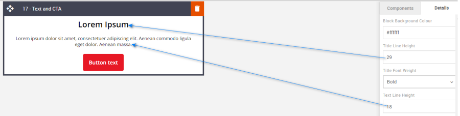
Line Height: Used to change the text line height.
As with all text, please be sure the minimum line height value is not less than 4px higher than the font size. For example, if the font size is 18px, the line height should not exceed 22px.
Option
Details
Default
Line Height
Title
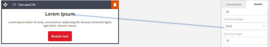
29
Text
18
Font Weight: Used to set the font weight of the title.
Option
Details
Dropdown
Default
Font Weight
Title
Bold/Normal
Bold
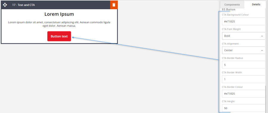
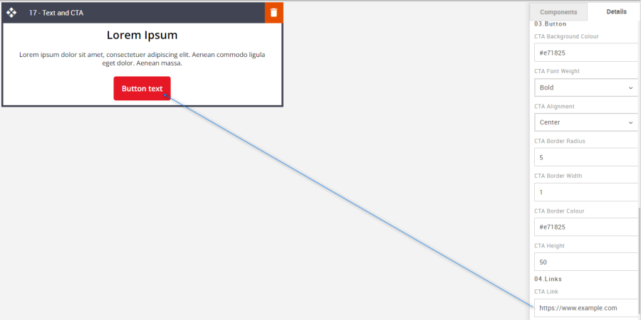
CTA: All CTA's have multiple styling options. As with all colors please use HEX values.
Option
Details
Default
CTA
Background Color
#e71825
Font weight
Bold
Alignment
Center
Border radius
5
Border width
1
Border Color
#e71825
Height
50
Links: Set the CTA link via this option.
Option
Details
Default
Link
CTA
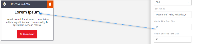
Mobile Title Font Size: The mobile font size can be set using the Advanced Tab.
Option
Details
Default
Font Size
Mobile Title Font Size
18
Compatibility:
Currently, the CTA button curved border does not render in the devices listed below. Instead, the corners will be square.
GMX Chrome Windows 10
GMX Edge Windows 10
GMX Firefox Windows 10
Web.de Chrome Windows 10
Web.de Edge Windows 10
Web.de Firefox Windows 10
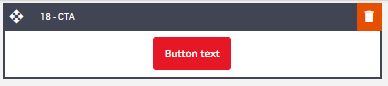
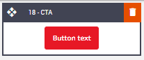
17 – CTA
Description: A stand-alone CTA block.
Default block view:
Desktop | Mobile |
|
|
Formatting options:
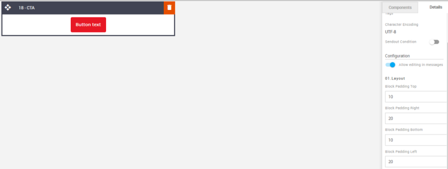
Padding: This refers to the space between the content of the block and its border. This can be edited in the Details Tab.
Option
Details
Default
Padding
Top
10
Right
20
Bottom
10
Left
20
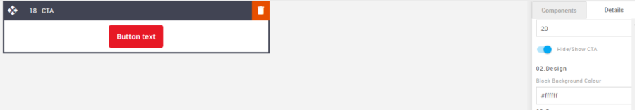
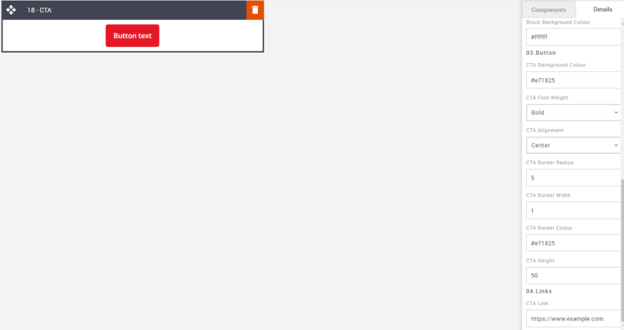
Block Background Color: Used to change the block background color. Only use HEX color values. HTML email only recognizes 6-digit long-hand versions and has patchy support for shorthand versions.
Option
Details
Default
Background Color
Block Background Color
#ffffff
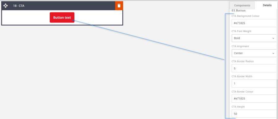
CTA: All CTA's have multiple styling options. As with all colors please use HEX values.
Option
Details
Default
CTA
Background Color
#e71825
Font weight
Bold
Alignment
Center
Border radius
5
Border width
1
Border Color
#e71825
Height
50
Links: Enter the CTA link in the CTA link field.
Option
Details
Default
Links
CTA
Compatibility:
Currently, the CTA button curved border does not render in the devices listed below. Instead, the corners will be square.
GMX Chrome Windows 10
GMX Edge Windows 10
GMX Firefox Windows 10
Web.de Chrome Windows 10
Web.de Edge Windows 10
Web.de Firefox Windows 10
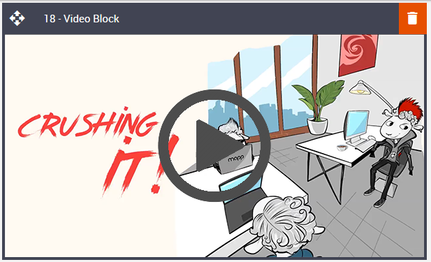
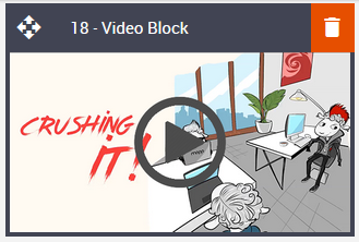
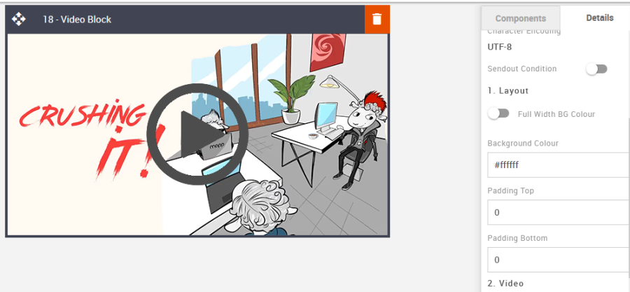
18 – Video block
Description:
Video block with a Gif image fallback support. This is not compatible across all devices; however, support is growing albeit very slowly. Although there are some excellent ways to utilize this block to feature it at its best. By utilizing a few extra assets, the block can give the appearance of an embedded video for those clients that are not compatible.
Some important notes:
- You need to create 4 assets and their URLs before editing the Video block. Save the URLs to a TXT file for later.
- Asset 1 – upload your video (short, low MB/GB file) to the content store.
- Asset 2 - Upload what will be called the poster image. This could be an image of your video's opening screen, first slide, or some other call-to-action. Do not overlay a 'play icon' on the image; the system will do that automatically.
- Asset 3 - Create the URL for where your video is hosted – youtube, landing page, etc.
- Asset 4 - Upload a fallback static image for all the email clients that do not support video in HTML email. This can be the same as the poster image above but add an overly 'play icon'.
Default block view:
Desktop | Mobile |
|
|
Formatting options:
Padding: As with all blocks the Video block is no exception when it comes to padding. Padding is the space between the content of the block and its border. This can be edited in the Details Tab in the usual way.
Option
Details
Default
Padding
Top
0
Right
0
Bottom
0
Left
0
Block Background Color: Used to change the block background color. Only use HEX color values. HTML email only recognizes 6-digit long-hand versions and has patchy support for shorthand versions.
Option
Details
Default
Background Color
Block Background Color
#ffffff
Video URL (MP4): Add the video URL. This can be loaded to the Content Store just like any other asset.
Option
Details
Default
Link
Video Link
https://amundsen.shortest-route.com/demo-dk/imgproxy/cont/2029110731/video-snip.mp4
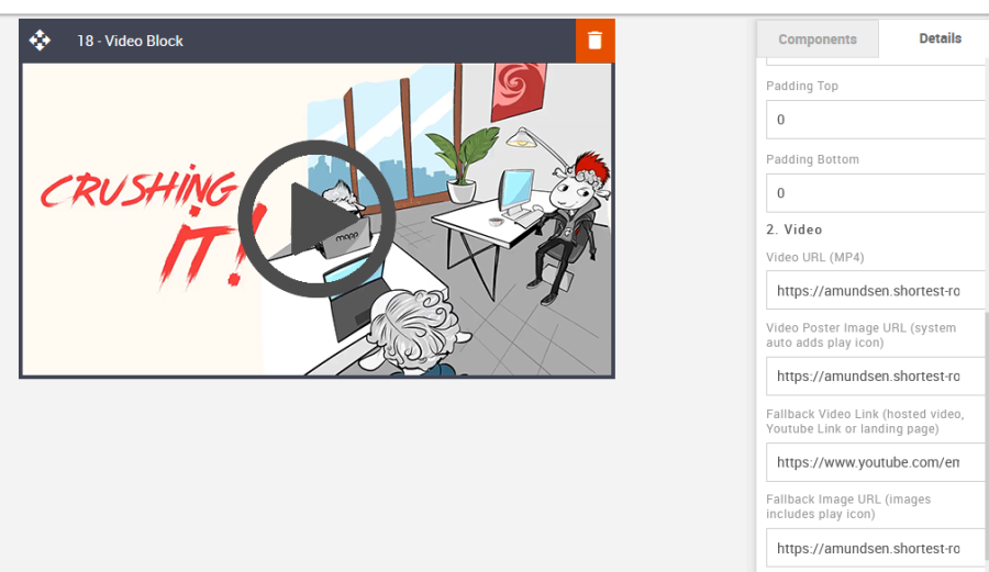
Video Poster Image URL: It allows you to apply a fallback image. This does not need a play icon.
Option
Details
Default
Image
Video Poster Image URL (system auto adds play icon)
https://amundsen.shortest-route.com/cts-demo/imgproxy/img/2040410182/preview_image.png
Fallback Video Link: Apply the link for where the video is hosted externally, like Youtube, your website, or a Mapp Engage landing page.
Option
Details
Default
Links
Fallback Video Link (hosted video, Youtube Link, or landing page)
https://www.youtube.com/embed/jfha5FPDBAk?rel=0&autoplay=1;fs=0;autohide=0;hd=0;
Fallback Image URL: Add the static fallback image URL
Option
Details
Default
Links
Fallback Image URL (image includes play icon)
https://amundsen.shortest-route.com/cts-demo/imgproxy/img/2040245173/video_poster.png
Compatibility:
As mentioned, there is limited support, but applying the fallback assets can give the appearance of an embedded video for all incompatible devices.
Interactive view:
Desktop | Mobile |
|
|
Fallback view:
Desktop | Mobile |
|
|
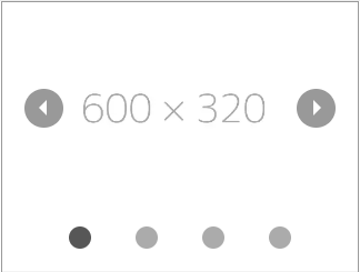
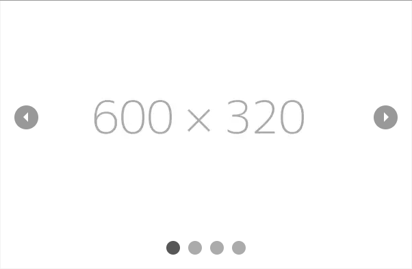
19 – Carousel
Description:
This block consists of a carousel of images that can display up to 4 images and apply thumbnails or different slide tabbing options. Left & right arrows can be hidden if desired. The client needs to add a static fallback image where devices are not compatible.
Like the Video & Carousel blocks, asset provision is important.
Default block view:
Desktop | Mobile |
|
|
Formatting options:
Padding: This refers to the space between the content of the block and its border. This can be edited in the Details Tab.
Option
Details
Default
Padding
Top
10
Right
0
Bottom
10
Left
0
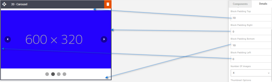
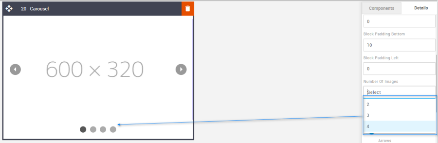
Number of images: Select up to four carousel image placements.
Option
Details
Default
Number Of Images
2
4
3
4
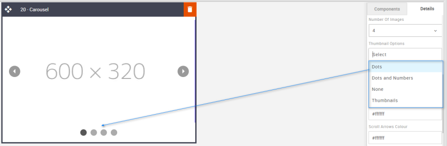
Thumbnail option: Use the drop-down to select 1 of 4 thumbnail style options.
Option
Details
Default
Thumbnail
Dots
Dots
Dots and Numbers
None
Thumbnails
Hide/Show: Used to select to hide or show the scroll arrows.
Option
Details
Default
Hide/Show
Scroll Arrows
Show
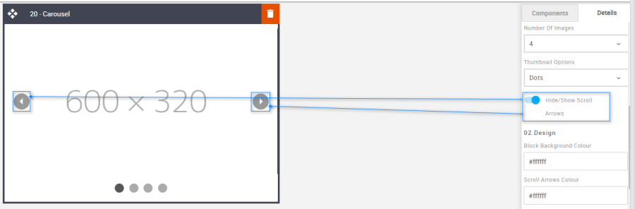
Block Background Color: Used to change the block background color. Only use HEX color values. HTML email only recognizes 6-digit long-hand versions and has patchy support for shorthand versions.
Option
Details
Default
Background Color
Block Background Color
#ffffff
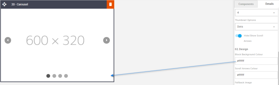
Scroll Arrows Color: Apply a color to the scroll arrows
Option
Details
Default
Scroll Arrow Color
Scroll Arrows Color
#ffffff
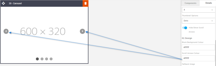
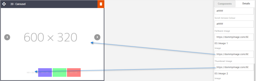
Fallback Image: Upload a fallback image to the Content Store then add the URL to the Fallback image field in the Details Tab.
Option
Details
Default
Image
Fallback Image
https://dummyimage.com/600x320/fff/aaa
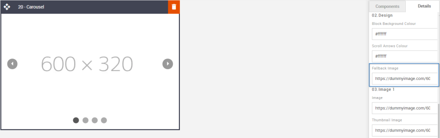
Scroll Images: Chang the scroll and thumbnail images.
Option
Details
Default
Image
Slider Image
https://dummyimage.com/600x320/fff/aaa
Thumbnail
Thumbnail Image
https://dummyimage.com/600x320/fff/aaa
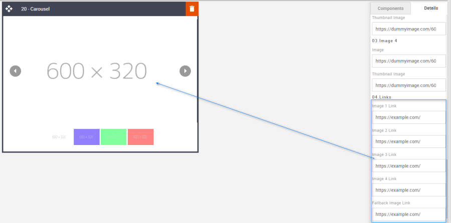
Links: It allows you to add the link to the images.
Option
Details
Default
Links
Image 1
Image 2
Image 3
Image 4
Fallback Image
Compatibility:
As mentioned with the Video block, there is limited support but applying a fallback asset for all devices that are incompatible will bridge the gap.
Interactive view:
Desktop | Mobile |
|
|
Fallback view:
Desktop | Mobile |
|
|
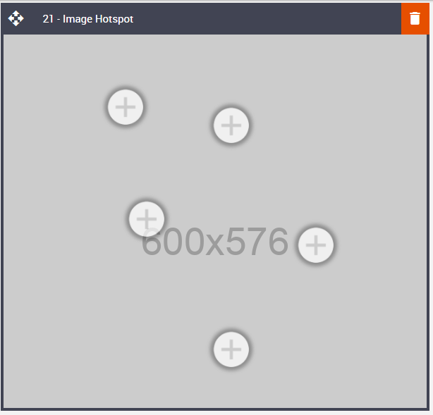
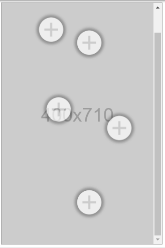
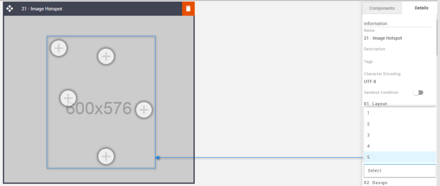
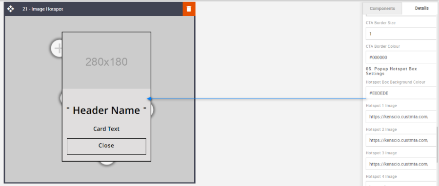
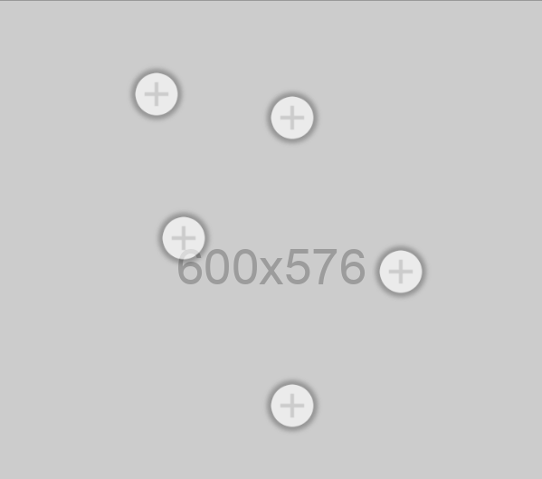
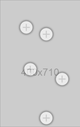
20 – Image Hotspot
Description:
This is a unique block and can only be used once per message. This is an interactive Hotspot block giving the recipient the opportunity to interact with the feature directly within the email itself. When a Hotspot is selected a small window appears on the screen. This window can contain all sorts of information – a description of the little black dress that was presented in a hero image, some nutritional information about a product, and so on. Each Hotspot contains a button too.
Like the Video & Carousel blocks, asset provision is important.
Default block view:
Desktop | Mobile |
|
|
Formatting options:
Padding: As with all blocks the Video block is no exception when it comes to padding. Padding is the space between the content of the block and its border. This can be edited in the Details Tab in the usual way.
Option
Details
Default
Padding
Top
0
Bottom
0
Number of Hotspots: Select up to 5 Hotspots using the drop-down menu.
Option
Dropdown
Default
Number Of Hotspots
1
5
2
3
4
5
Block Background Color: Used to change the block background color. Only use HEX color values. HTML email only recognizes 6-digit long-hand versions and has patchy support for shorthand versions.
Option
Details
Default
Background Color
Block Background Color
#ffffff
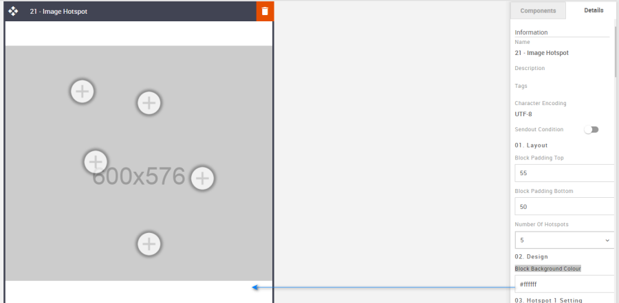
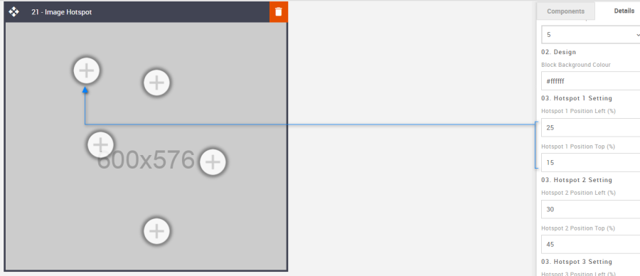
Hotspot 1 Setting: Each hotspot can be positioned independently of one another. Place them at key locations over your hero image without obscuring the image's intent. Enter a percentage value without adding the % symbol. The block will do that automatically.
All the hotspot options are the same, although they all start off in different default places on the hero image. Here are the defaults for Hotspot Number 1.
Option
Details
Default
Hotspot 1 Setting
Hotspot 1 Position Left (%)
25
Hotspot 1 Position Top (%)
15
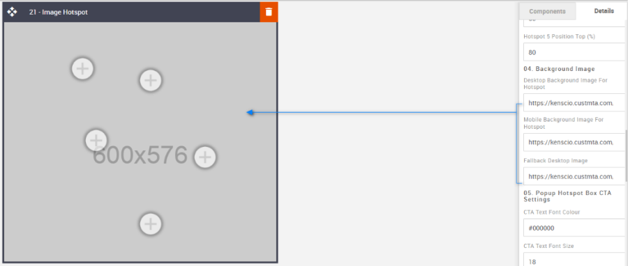
Background Image: The background image is your key feature hero image, over which the Hotspot will be placed. A desktop, mobile, and fallback will be required. Use the default images as image-sizing templates.
Option
Details
Default
Background Image
Desktop Background Image for Hotspot
https://amundsen.shortest-route.com/cts-demo/public/lpbp/imgPlaceHolder.jsp?widthPH=600&heightPH=576&bgPH=cccccc&fontColor=969696
Mobile Background Image for Hotspot
https://amundsen.shortest-route.com/cts-demo/public/lpbp/imgPlaceHolder.jsp?widthPH=400&heightPH=710&bgPH=cccccc&fontColor=969696
Fallback Desktop Image
https://amundsen.shortest-route.com/cts-demo/public/lpbp/imgPlaceHolder.jsp?widthPH=600&heightPH=576&bgPH=cccccc&fontColor=969696
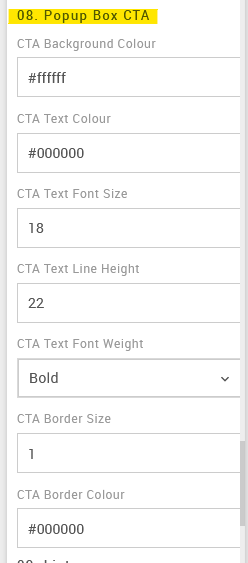
Popup Box CTA Settings: It allows you to format the CTA button as per the requirement. Details below. It takes the hexacode of the color as the value to change the color wherever applicable.
Option
Details
Default
Popup Box CTA Settings
CTA Background Color
#ffffff
CTA Text Color
#000000
CTA Text Font Size
18
CTA Text Line Height
22
CTA Text Font Weight
Bold
CTA Border Size
1
CTA Border Color
#000000
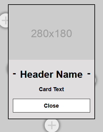
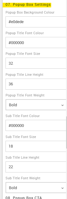
Popup box settings: It allows you to format the Content style as per the requirement. Details below. It takes the hexacode of the color as the value to change the color wherever applicable.
Option
Details
Default
Popup box settings
Popup Box Background Color
#e0dede
Popup Title Font Color
#000000
Popup Title Font Size
32
Popup Title Line Height
36
Popup Title Font Weight
Bold
Sub Title Font Color
#000000
Sub Title Font Size
18
Sub Title Line Height
22
Sub Title Font Weight
Bold
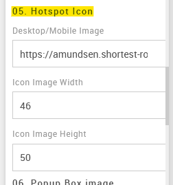
Hotspot Icon: This is where the Hotspot icon can be changed. All Hotspots will use the same image.
Option
Details
Default
Hotspot icon image
Hotspot Icon
https://amundsen.shortest-route.com/cts-demo/imgproxy/img/2040365428/hotspot_icon.png
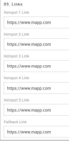
Hotspot Links & Fallback Link: All links are independent.
Option
Details
Default
Hotspot Links
Link
Fallback Link
Link
Compatibility:
As mentioned with the Video & Carousel blocks, there is limited support but applying a fallback asset for all devices that are incompatible will bridge the gap.
Interactive view:
Desktop | Mobile |
|
|
Fallback view:
Desktop | Mobile |
|
|
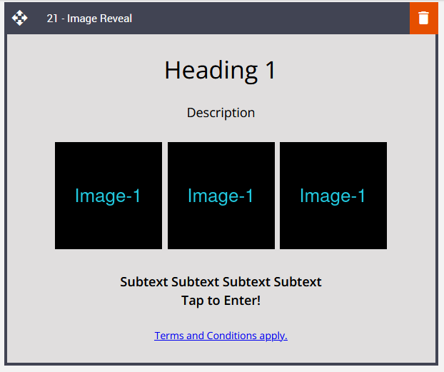
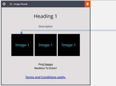
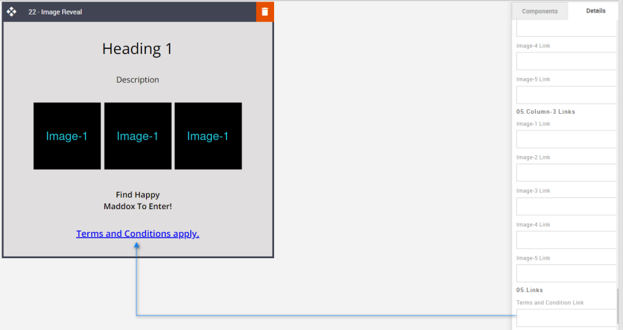
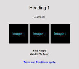
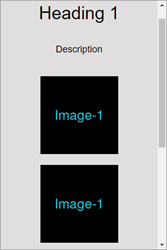
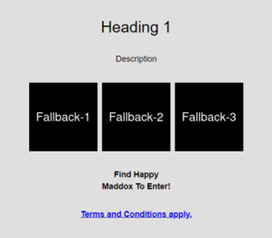
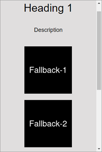
21 – Image Reveal
Description:
Interactive Image Reveal block. Images can be clicked to reveal up to five underlying images, tap each image to reveal the next, and so on. These could show offers, questions, and answers to a quiz, etc. The last layer can be an external link; however, a link can be applied to any layer, but subsequent layers are removed. All elements are editable and can be hidden or shown.
Default block view:
Desktop | Mobile |
|
|
Formatting options:
Padding refers to the space between the block's content and border. This can be edited per the requirements using the panel on the right side (Details tab).
Option
Details
Default
Heading Top Padding
Description Top Padding
Images Top Padding
T&C's Top PaddingTop
30
Subtext 1 Top Padding
Subtext 2 Top PaddingTop
0
Subtext 1 Bottom Padding
Subtext 2 Bottom PaddingBottom
0
Heading Bottom Padding
Description Bottom Padding
Images Bottom PaddingBottom
0
T&C's Bottom Padding
Bottom
30
Block Background Color: Used to change the block background color. Only use HEX color values. HTML email only recognizes 6-digit long-hand versions and has patchy support for shorthand versions.
Option
Details
Default
Background Color
Block Background Color
#e0dede
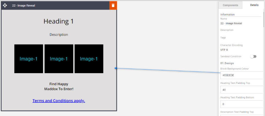
Font Weight: Used to change the font sizes for each element.
Option
Details
Default
Heading Font Size
Values are in px; enter values
34
Description Font Size 18 Subtext Font Size 18 T&C's Font Size 14 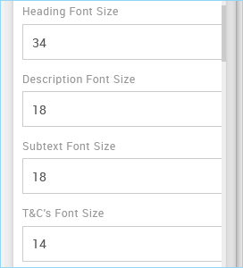
Hide/Show: Use the toggles to hide or show all the different elements.
Option
Details
Default
Hide/Show Heading
Show Description
Show Subtext-1
Show Subtext-2
Show T&C's
Show Image Selection: It allows you to change the number of images from 0 to 3.
Option
Details
Default
Image Quantity? 0 - Images 3 - Images 1 - Image 2 - Images 3 - Images 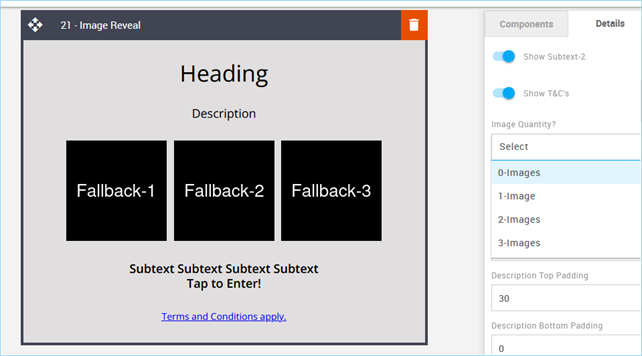
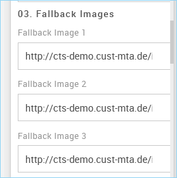
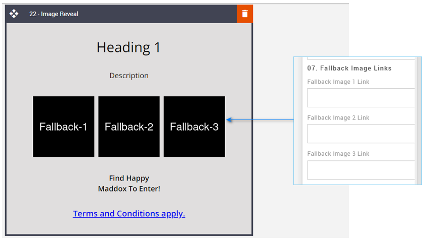
Fallback Images: Upload the fallback images to the Content Store and add the image URLs to the relevant fields in the Details Tab.
Only the fallback image will be visible in the Editing UI.
Option
Details
Default
Fallback Images
Fallback Image 1
http://cts-demo.cust-mta.de/imgproxy/img/2041545096/fallback_01.png
Fallback Image 2
http://cts-demo.cust-mta.de/imgproxy/img/2041545097/fallback_02.png
Fallback Image 3
http://cts-demo.cust-mta.de/imgproxy/img/2041545098/fallback_03.png
Reveal Images: This refers to the options to add the reveal images. Upload the images to the content store first, then add the image URLs to the relevant fields in the Details Tab.
You must do this for all the reveal images you want to use. If you only have two main images and wish to have three taps to reveal those, then you will need to upload six reveal images. 3 for position one and 3 for position 2.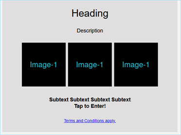
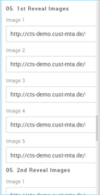
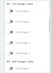
Image Links: This refers to the option to link the image between the 1 to 5 images.
The setting is the same for each set of links. Adding a link to reveal two on position one means the tap/reveal will stop at reveal 2, and the 3rd will not render. Leaving all five off will render all five reveal images.
Option
Details
Default
Interactive Image Toggle Links
Link Image 1
Off
Link Image 2
Off
Link Image 3
Off
Link Image 4
Off
Link Image 5
Off
Fallback Image Links: It allows you to add the link to the fallback image.
Option
Details
Default
Fallback Image Links
Fallback Image 1 Link
Blank
Fallback Image 2 Link
Blank
Fallback Image 3 Link
Blank
T&C's Link: Add the terms and conditions should they be needed.
Option
Details
Default
T&C's Link
Terms and Conditions Link
Blank
Compatibility:
As with the Video, Carousel & Hotspot blocks, there can be limited support, but applying fallback assets for incompatible devices will still make for enjoyable viewing and interaction.
Interactive view:
| Desktop | Mobile |
|
|
Fallback view:
| Desktop | Mobile |
|
|
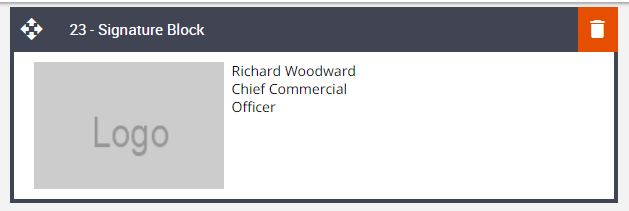
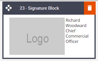
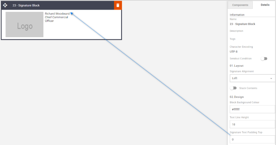
22 – Signature Block
Description:
A basic Signature block but one that gets asked for on occasion. All the elements are editable in terms of styling and alignment. And a branded logo or signature image applied.
Default block view:
Desktop | Mobile |
|
|
Formatting options:
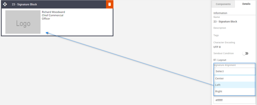
Signature Alignment: Used to align content left, center, or right.
Option
Details
Default
Alignment
Center
Left
Left
Right
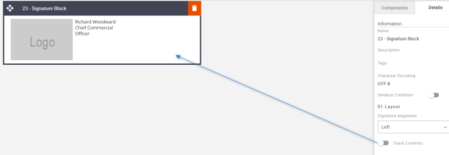
Stack Contents: It allows us to switch the order of the content side by side with an image or in such a way that the content appears below the image.
Option
Details
Default
Toggle
Stack Contents
Off
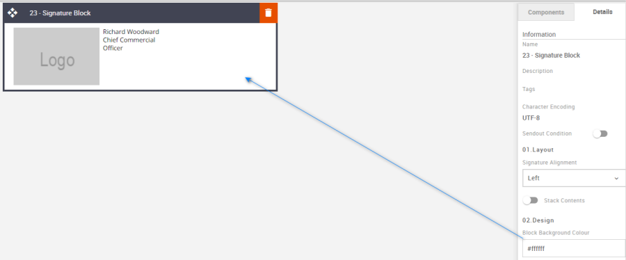
Block Background Color: Used to change the block background color. Only use HEX color values. HTML email only recognizes 6-digit long-hand versions and has patchy support for shorthand versions.
Option
Details
Default
Background Color
Block Background Color
#ffffff
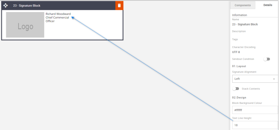
Line Height: Used to change the text line height.
As with all text, please be sure the minimum line height value is not less than 4px higher than the font size. For example, if the font size is 18px, the line height should not exceed 22px.
Option
Details
Default
Line Height
Text
18
Signature Text Padding Top refers to the space between the text and the block. This can be edited as per the requirements using the panel on the right side (Details tab).
Option
Details
Default
Padding
Top
0
Compatibility:
There are no known render issues with this block.
23 – Social Icon Block
Description:
This is a stand-alone Social Icon block where there is the option for up to six social media images and their respective text and links. There is no stacking option in the block, therefore there are limitations on text space. This would need to be conveyed to the client and used wisely. However, there is an option to hide or show the text too. Equally this block could have other uses, such as for service or guarantee, or award icons too.
Default block view:
Desktop | Mobile |
|
|
Formatting options:
Padding: This refers to the space between the content of the block and its border. This can be edited as per the requirements using the panel on the right side (Details tab).
Option
Details
Default
Padding
Top
20
Right
10
Bottom
20
Left
10
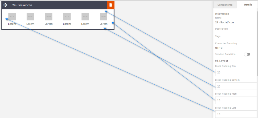
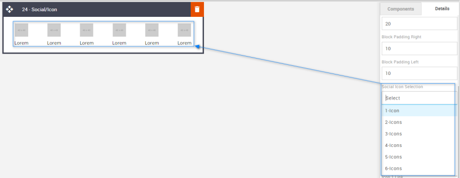
Social Icons: Up to 6 icons can be selected from the drop-down menu.
Option
Details
Default
Social Icon Selection
1-Icon
6-Icons
2-Icons
3-Icons
4-Icons
5-Icons
6-Icons
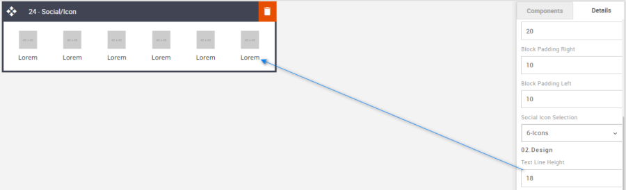
Line Height: Used to change the text line height.
As with all text, please be sure the minimum line height value is not less than 4px higher than the font size. For example, if the font size is 18px, the line height should not exceed 22px.Option
Details
Default
Line Height
Text
18
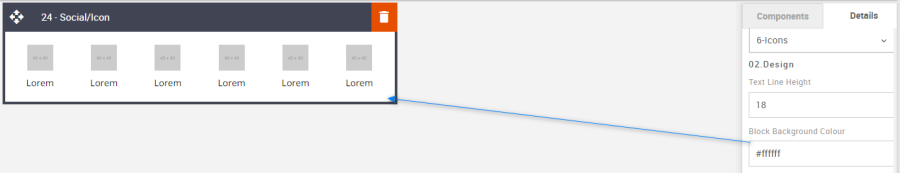
Block Background Color: Used to change the block background color. Only use HEX color values. HTML email only recognizes 6-digit long-hand versions and has patchy support for shorthand versions.
Option
Details
Default
Background Color
Block Background Color
#ffffff
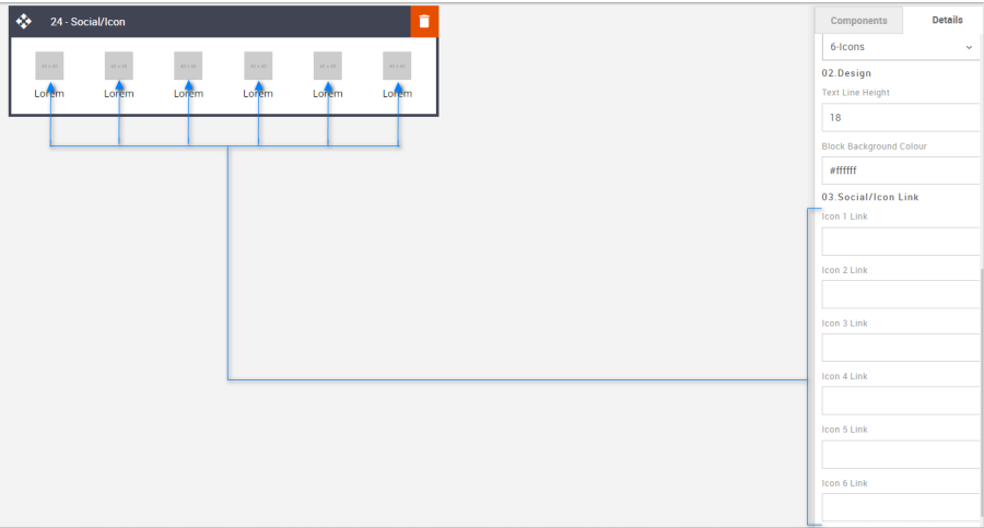
Social Icon Links: It allows you to add the link to the image.
Option
Details
Default
Links
Icon 1 Link
Blank
Icon 2 Link
Icon 3 Link
Icon 4 Link
Icon 5 Link
Icon 6 Link
Compatibility:
There are no known render issues with this block.
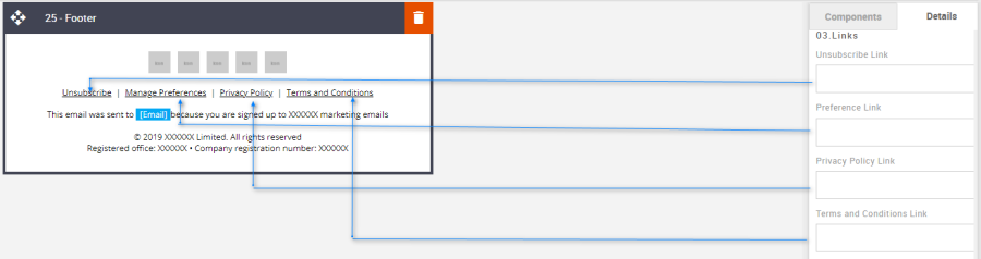
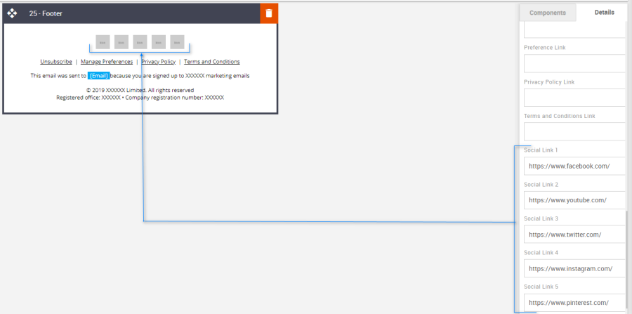
24 – Footer Block
Description:
All social media, legal, unsubscribe link, and company information is held here. This block also contains a social icon section which can be hidden or shown, or 1 to 5 icons selected.
Default block view:
Desktop | Mobile |
|
|
Formatting options:
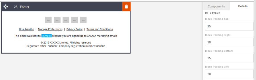
Padding: This refers to the space between the content of the block and its border. This can be edited in the Details Tab.
Option
Details
Default
Padding
Top
25
Right
20
Bottom
25
Left
20
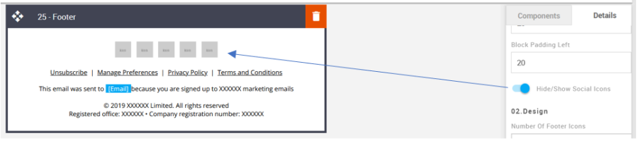
Hide/Show Social Icons: Use the toggle to hide or show the social media icons.
Option
Details
Default
Hide/Show
Social Icons
Show
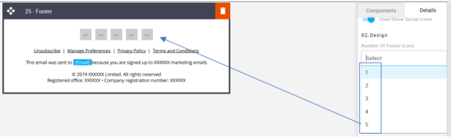
Number of Footer Icons: Used the drop-down menu to select how many social media icons are required.
Option
Details
Default
Number of Footer Icons
1
5
2
3
4
5
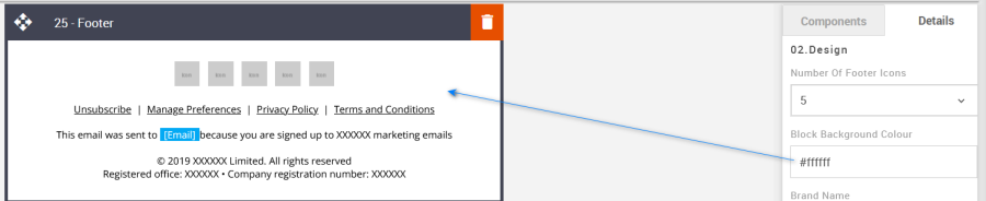
Block Background Color: Used to change the block background color. Only use HEX color values. HTML email only recognizes 6-digit long-hand versions and has patchy support for shorthand versions.
Option
Details
Default
Background Color
Block Background Color
#ffffff
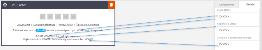
Brand and Registered Info: This is where the Brand name, Registered office, and Company Registration Number can be edited.
Option
Details
Default
Brand Name
Brand Name
XXXXXX
Registered Office
Registered Office
XXXXXX
Registration Number
Company Registration Number
XXXXXX
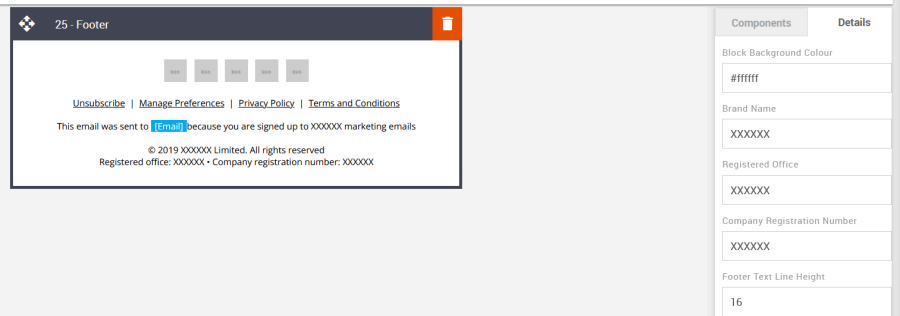
Line Height: Used to change the text line height.
As with all text, please be sure the minimum line height value is not less than 4px higher than the font size. For example, if the font size is 18px, the line height should not exceed 22px.
Option
Details
Default
Line Height
Text
16
Links: Where to apply all the legal links.
Option
Details
Default
Footer Links
Unsubscribe
Blank
Preference
Blank
Privacy Policy
Blank
Term and Conditions
Blank
Social Links: Where to apply all the social media links.
Option
Details
Default
Social Links
Social Link 1
Social Link 2
Social Link 3
Social Link 4
Social Link 5
Compatibility:
There are no known render issues with this block.
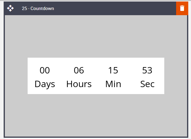
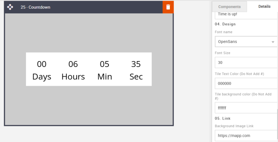
25 – Countdown
Description:
A countdown timer block with lots of editable features. An extremely useful tool in terms of call-to-action. This is now compatible across all known email clients with a slight exception for some desktop Outlook versions. It renders the countdown, but the timer movement is static and will not be seen to physically count down as in all other email clients. The time will change on each open instead.
The countdown End Time needs to use the UTC timezone.
Default block view:
Desktop | Mobile |
|
|
Formatting options:
Padding: This refers to the space between the content of the block and its border. This can be edited as per the requirements using the panel on the right side (Details tab)
Option
Details
Default
Padding
Top and bottom
0
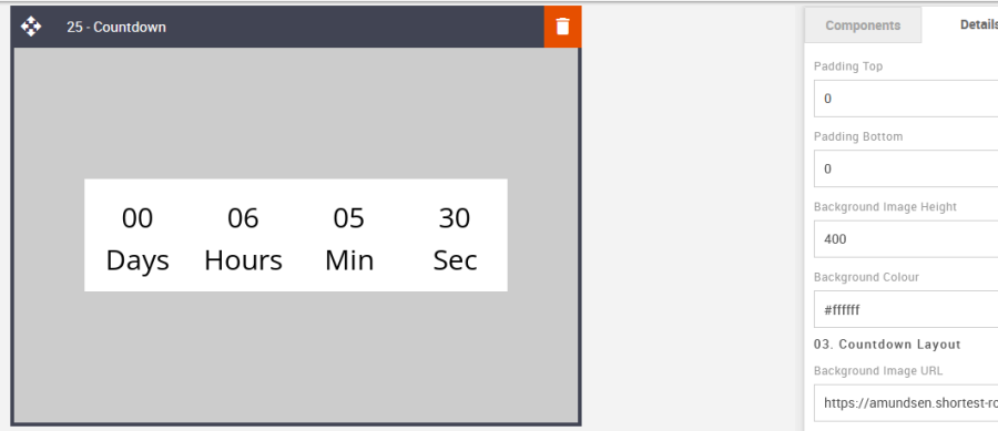
Countdown Layout: Here, all the countdown layout settings can be set.
Option
Details
Default
Image
Background Image URL
https://amundsen.shortest-route.com/cts-demo/imgproxy/img/2040384506/600x400.png
Layout
Captions Stacked
Captions Stacked
Countdown width
Countdown width
400
Countdown Height
Countdown Height
120
Countdown Settings: Here all the settings for the countdown can be set.
Option
Details
Default
End Date
Add date
2023-06-23
End Time
Captions Stacked
22:00
Date captions
Date captions (separated by comma)
Days, Hours, Min, Sec
Message when time is up
Countdown Height
The time is up!
Block Background Color: Used to change the block background color. Only use HEX color values. HTML email only recognizes 6-digit long-hand versions and has patchy support for shorthand versions.
Option
Details
Default
Background Color
Block Background Color
#ffffff
Count-Down Link: It allows us to add the link to the Count-Down timer.
Option
Details
Default
Countdown Link
Countdown Link
https://mapp.com
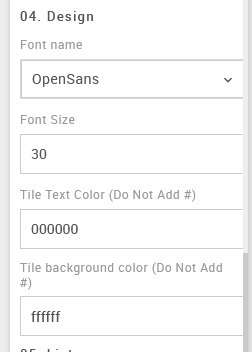
Countdown Design: Here you can add all the design elements.
Option
Details
Default
Countdown Options
Font name
OpenSans
Font Size
30
Tile text Color (Do Not Add #)
000000
Tile background Color (Do Not Add #)
ffffff
Compatibility:
For a few versions of desktop Outlook the timer movement is static and will not be seen to physically count down as it does in all other email clients, including mobile. The time will change on each open instead.
26 – Ordered or Unordered list
Description:
This block can be used to create up to 4 rows of an ordered or unordered list with a variety of different style choices. Select numbers, and characters, or load a custom image to use as the marker points. There are alignment and font styling options.
Default block view:
Desktop | Mobile |
|
|
Formatting options:
Padding: This refers to the space between the content of the block and its border. This can be edited in the Details Tab.
Option
Details
Default
Padding
Top
10
Right
20
Bottom
10
Left
20
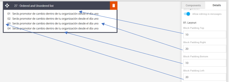
Block Background Color: Used to change the block background color. Only use HEX color values. HTML email only recognizes 6-digit long-hand versions and has patchy support for shorthand versions.
Option
Details
Default
Background Color
Block Background Color
#ffffff
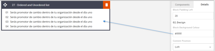
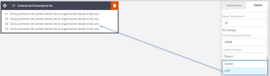
Content Position: Used to align the content Left or Center. There is no right option in this instance.
Option
Details
Default
Content Position
Left
Left
Center
Number of Rows: Use the drop-down menu to select up to 4 rows.
Option
Details
Default
Number of Rows
1
4
2
3
4
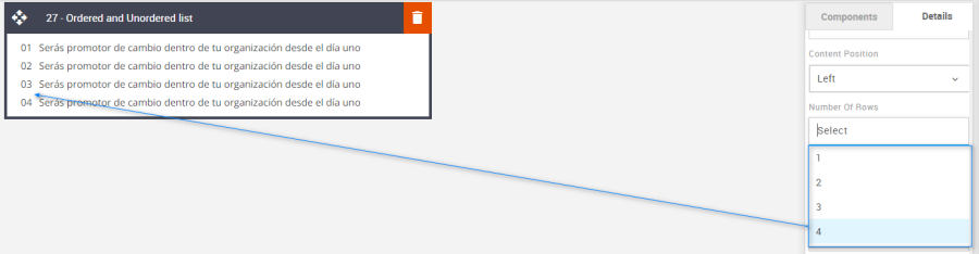
Type of List: Use the drop-down menu to select up to four different styled markers.
Option
Details
Default
Type of List
Circle
Number/Characters
Image
Number/Characters
Square
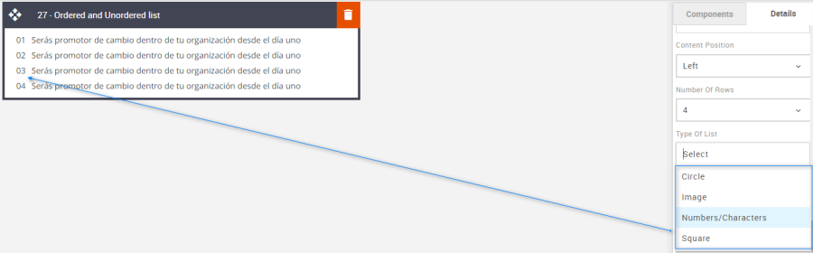
Line Height: Used to change the text line height.
, please be sure the minimum line height value is not less than 4px higher than the font size. For example, if the font size is 18px, the line height should not exceed 22px.
Option
Details
Default
Line Height
Text
18
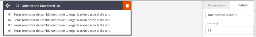
List Marker Image: Apply a unique image marker. Upload the new image to the Content Store and paste the URL into the List Marker Image field.
Option
Details
Default
List
List Maker image
https://amundsen.shortest-route.com/cts-demo/imgproxy/img/2040365779/tict_img.png
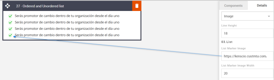
List Marker Image Width: The width of the Marker can also be set.
Option
Details
Default
List
Marker image Width
20
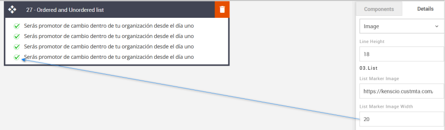
List Marker Color: This option will change the color of the list marker when Numbers/Characters, circles, or squares are selected.
Option
Details
Default
List
Maker Color
#363636
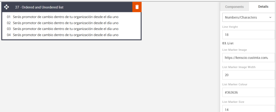
List Marker Size: The Numbers/Characters, Circle, or Square size can be set here.
Option
Details
Default
List
Maker Size
14
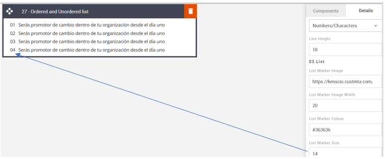
Compatibility:
There are no known render issues with this block.
27 – Tabbed Effect
Description:
An interactive block where the recipient is able to click tabs within the email, displaying selected text relevant to each tab. Up to 4 tabs can be selected. Each body of text and styling is independent of one another.
Default block view:
Desktop | Mobile |
|
|
Formatting options:
Padding: This refers to the space between the content of the block and its border. This can be edited in the Details Tab.
Option
Details
Default
Padding
Top
10
Right
10
Bottom
10
Left
10
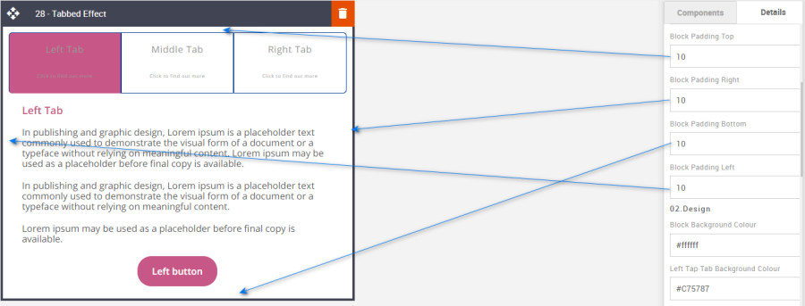
Tab Selection: Select the number of tabs required from the drop-down menu.
Option
Details
Default
Number Of Tab Selection
2-Tabs
3-Tabs
3-Tabs
4-Tabs
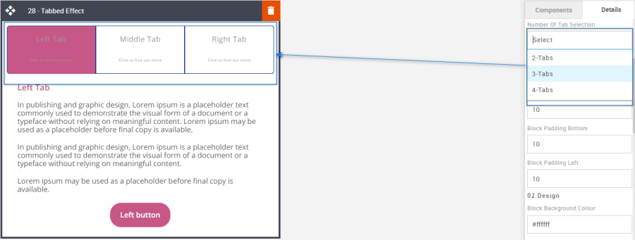
Block Background Color: Used to change the block background color. Only use HEX color values. HTML email only recognizes 6-digit long-hand versions and has patchy support for shorthand versions.
Option
Details
Default
Background Color
Block Background Color
#ffffff
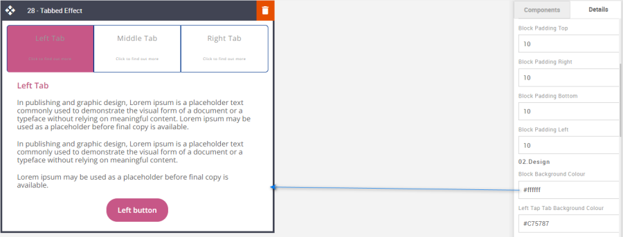
Tap Tab Background Color: Each tab can be Colored individually.
Option
Details
Default
Tap Tab Background Color
Left Tap Tab Background Color
#C75787
Middle Tap Tab Background Color
#01797A
Extra Tap Tab Background Color
#F9413A
Right Tap Tab Background Color
#014A97
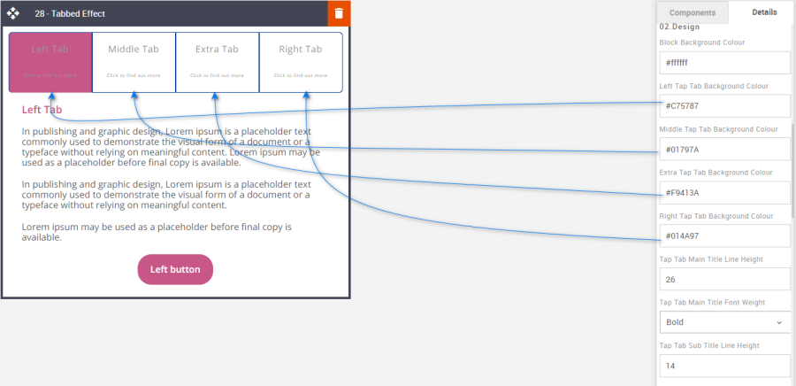
Font Weight: Edit the font weight in the tab's section.
Option
Details
Dropdown
Default
Font Weight
Tap Tab Main Title Font Weight
Bold/Normal
Bold
Tab Title Font Weight
Bold
Line Height: Used to change the text line height.
As with all text, the minimum line height value is not less than 4px higher than the font size. For example, if the font size is 18px, the line height should not exceed 22px.
Option
Details
Default
Line Height
Tap Tab Main Title Line Height
26
Tap Tab Sub Title Line Height
14
Tab Title Line Height
18
Tab Text Line Height
18
Tab Title and Text Alignment: Change the position of the Tab title text using the drop-down. The title text also moves accordingly.
Option
Dropdown
Default
Title and Text Alignment
Center
Left
Left
Right
CTA: All CTA's have multiple styling options. As with all colors please use HEX values.
Option
Details
Default
CTA
Left Tab CTA Background Color
#C75787
Middle Tab CTA Background Color
#01797A
Extra Tab CTA Background Color
#F9413A
Right Tab CTA Background Color
#014A97
CTA Alignment
Center
Text Color
#ffffff
Font weight
Bold
Border radius
25
Border width
1
Border Color
#e71825
Height
52
Links: Add all the relevant Tab CTA's.
Option
Details
Default
Links
Left Tab CTA Link
Middle Tab CTA Link
Extra Tab CTA Link
Right Tab CTA Link
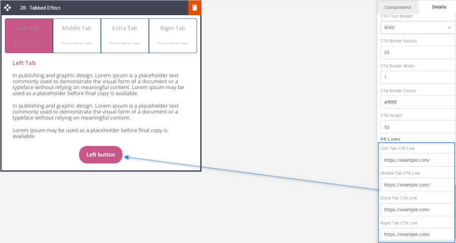
Compatibility:
As mentioned with all interactive blocks. There can be limited support, but applying fallback assets for incompatible devices will still make for enjoyable viewing. In this instance, the fallback is always the first Tab contents.
Interactive view:
Desktop | Mobile |
|
|

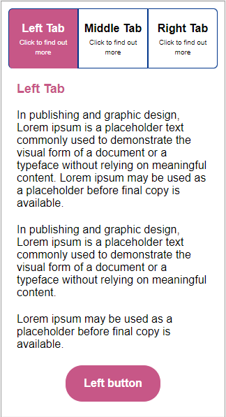
Fallback view:
Desktop | Mobile |
|
|
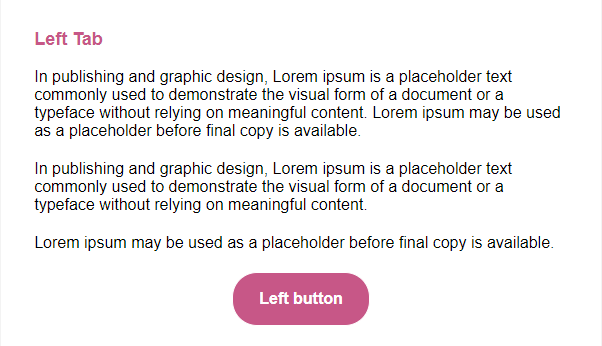
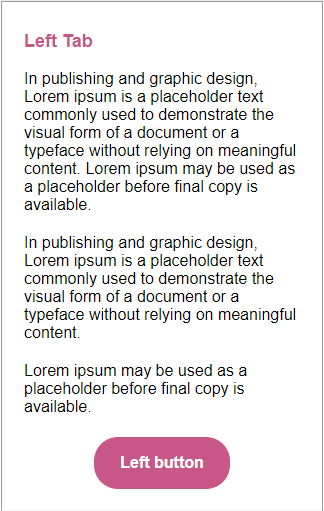