User Interface 1 – User Interface
This training chapter provides an introduction into the components and functionality of the user interface of Mapp Intelligence.
1 General Information
1.1 General remarks
- Browser
For the best possible performance, please use a current browser version. To update a supported browser, refer to their documentation:
We generally only support desktop browsers for Mapp Cloud applications' user interface. Ad blockers should be deactivated because otherwise, problems can occur when trying to log in. Parallel usage of Mapp Intelligence in multiple tabs is only possible in the „private“ or „incognito“ mode of your browser. - Updates
The Mapp Intelligence system is subject to ongoing optimization and further development. Updates are installed automatically. An overview of recent adaptions can be found in “Release Notes”. Register for the newsletter to stay updated.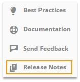
- Data Updates
Analysis data is usually updated every 60 minutes. The exact point of time of the last update is shown below the analysis.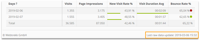
- Automatic Logout
Automatic logout takes place after 30 minutes of inactivity.
1.2 Top Navigation
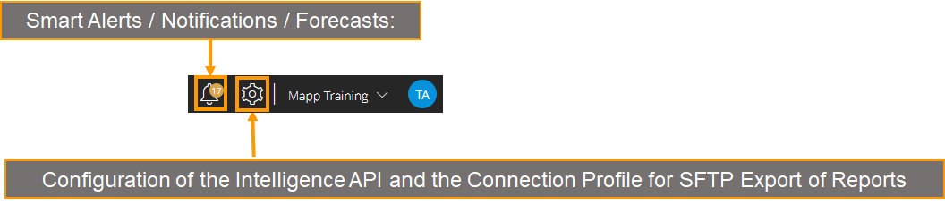
- Alerts / Notifications / Forecasts: Allows you to get notifications about changes, insights, and predictions of how your data may develop.
- Configuration of the Intelligence API: Allows the creation of tokens via which the Intelligence API can be used in external tools.
- Connection Profile for SFTP export of reports. If a report needs to be uploaded to an SFTP server, the connection settings for the SFTP server are saved here.
At My Profile, the user can set the language for the user interface, choose the number format, and change the password.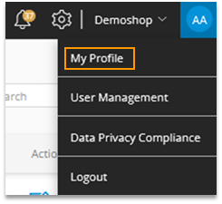
| Changing the language does not have an effect on custom elements, e.g., custom metrics, custom formulas, categories, and parameters. |
|---|
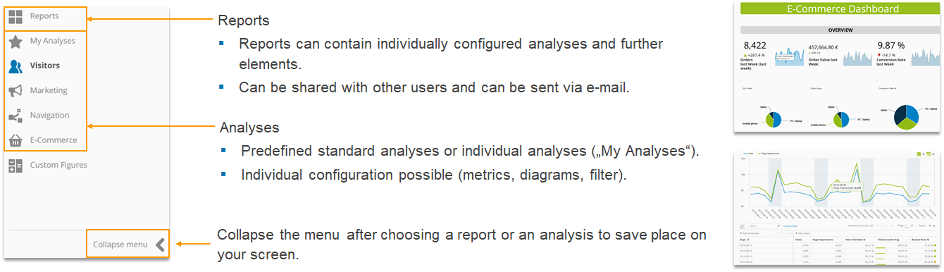
1.3 Structure of the main menu
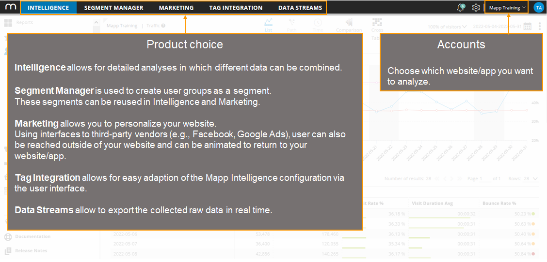
Mapp Intelligence distinguishes between analyses and reports.
| Information on reports can be found in the training chapter Custom Reports. |
|---|
Analyses are structured into different categories within the main menu:
- Visitors: time-related dimensions (e.g., day, week), geography, and technology
- Marketing: Website goals, Referrers, search phrases, and campaign analyses
- Navigation: Pages and content groups, usage of links, forms, and funnels
- E-Commerce: Products and orders
- Video Analytics: (optional) analysis of videos
2 Analyses View
This chapter describes all settings that can be changed in an analysis.
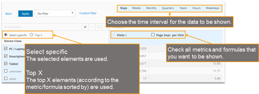
2.1 Analysis period
By default, the last 28 days are used as the analysis period.
- Using the calendar, you can adapt the analysis period.
- The selected time frame is highlighted in blue.
- All times relate to the timezone that is set for the account. It is shown on the upper right.
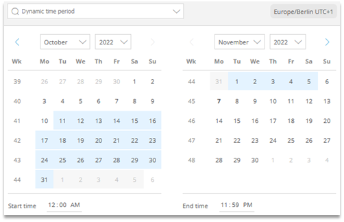
Fixed time period
By clicking on a day, two days, or on a calendar week a fixed time
period can be chosen.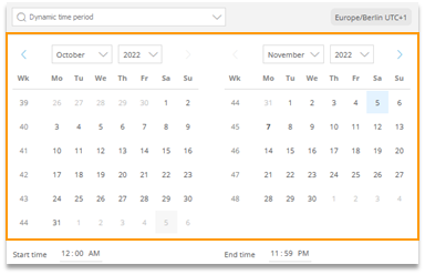
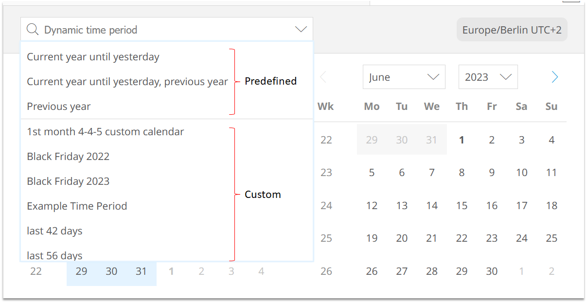
Dynamic time period
Dynamic time periods can be chosen from the drop-down menu.
They are called “dynamic“ because the resulting time period depends on the current date.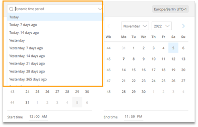
If necessary, apply a start time to the start date and an end time to the end date. By default, the full start and end day is selected.
This works for static as well as for dynamic time periods.
Example:
The following example shows all data between Dec 24th, 2021, 05:00 PM and Dec 26th, 2021, 10:00 PM.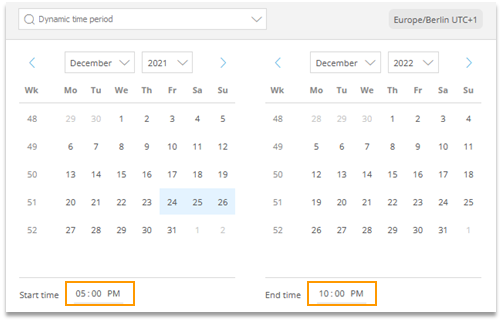
Custom time periods
Additionally, you can have custom time periods at the drop-down menu which can be created by each user with Admin rights. Find more details in the corresponding help article.
| Changes to the analysis period are taken over for all succeeding analyses. |
|---|
2.2 Metrics in an Analysis
Each analysis includes predefined metrics and formulas. They can be changed and substituted.
- Each adaption that you make is only saved temporarily.
- When you log out or call another account, the default settings are used again.
For long-term storage of the adjustments, you must save your analysis (see Section 2.8).
You can find a video on this topic. |
|---|
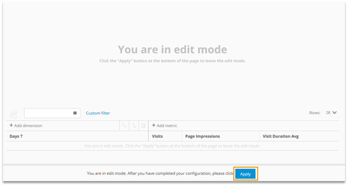
2.2.1 Adding metrics and formulas
To add metrics and formulas to an analysis, proceed as follows:
- Click on „Add metric“.
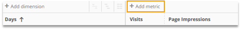
Choose the metrics in the group or list view.
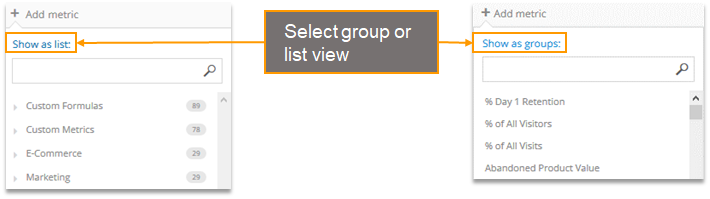
You can search for metrics in the list view and the group view.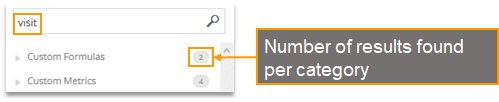
Accept the configuration by clicking Apply.
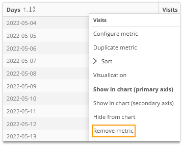
2.2.2 Removing metrics and formulas
To remove a metric or formula from an analysis, proceed as follows:
- Right-click on the name of the metric to open the context menu.
- Click on Remove metric.
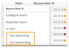
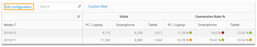
2.2.3 Sorting and Order
Dimensions and metrics can be sorted in increasing or decreasing order using the context menu.
An arrow shows the current sorting. The numbers next to the arrow show if the sorting is ascending or descending.
descending: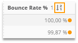
ascending: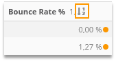
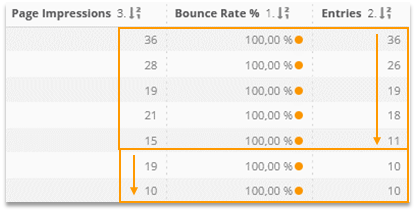
You can sort by up to three metrics simultaneously (Prio 1: high, 3: low). If there are several same values for the metric with Prio 1, the dimension will be sorted by the metric with Prio 2.
Example: In the following screenshot all values are sorted first by Bounce Rate, then by Entries, then by Page Impressions.
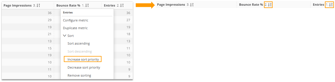
You can increase or decrease the sorting priority step by step.
Example:
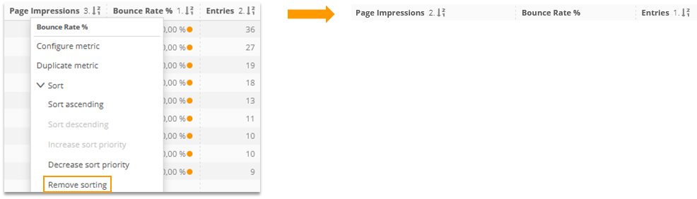
The existing sorting of a metric can be removed; however, there must exist a sorting for at least one metric or dimension.
The order of the dimensions and metrics in the data table can be adapted via drag&drop using the mouse (click on the name of the corresponding metric or dimension).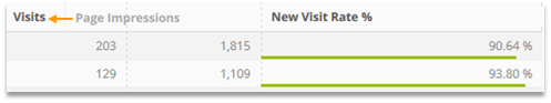
2.2.4 Resetting Analyses
All adaptions made in an analysis are saved temporarily.
If you need to go back to the standard configuration, you have the following options:
- Reloading the analysis in the browser (e.g., by pressing „F5“)
- Logging out and logging in again
- Choosing another account and switching back to the desired account for analysis.
2.3 Analysis variants
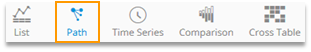
There are different variants in which an analysis can be shown.
- List
- Time Series
- Comparison
- Path
- Cross Table
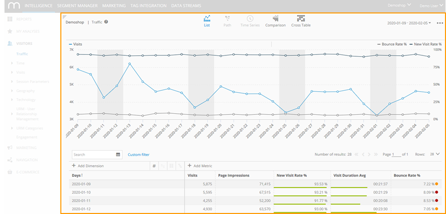
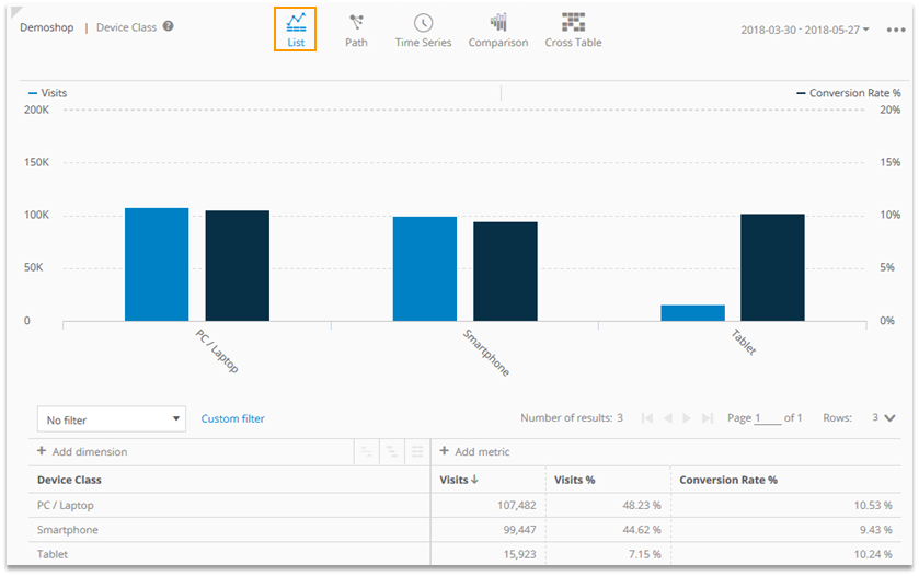
2.3.1 List
"List" shows the analysis of a single dimension.
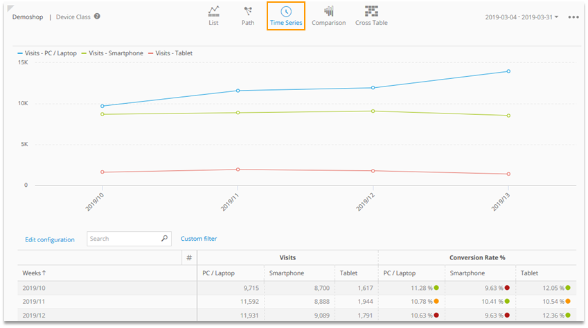
2.3.2 Time Series
The Time series view shows the development of chosen dimension values over time.
You can find a video on this topic. |
|---|
Activating the Time series view
- In an analysis click on the Time series symbol. Only available with non-time dimensions.
- Click on the time series.
- Finish the configuration by clicking on „Apply“.
Editing the Time series view
To edit the Time series, click on Edit configuration.
Generally, a maximum of 15 columns can be shown in Mapp Intelligence. A configuration that exceeds this limit (i.e., 5 elements of a dimension and 4 metrics = 20 columns) is impossible. |
|---|
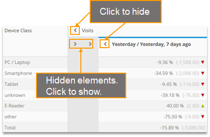
2.3.3 Comparison
Comparison is one of the most important functions as it shows varying trends of different metrics and formulas.
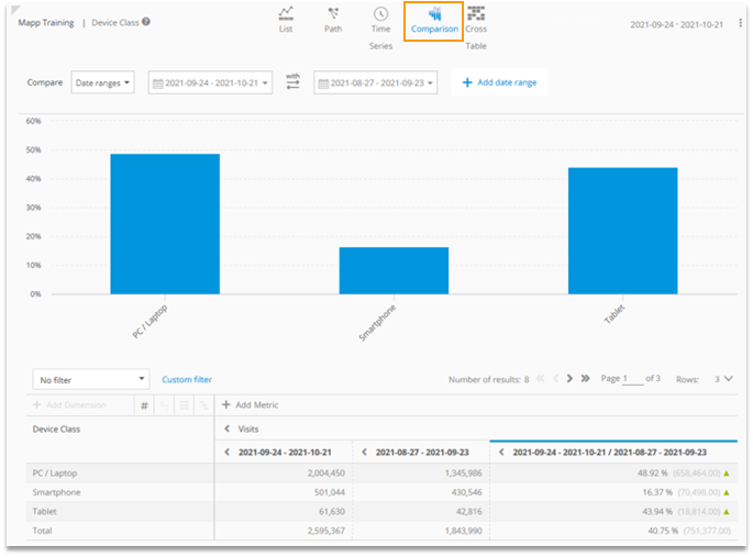
It is possible to analyze date ranges and segments (i.e., saved groups of users, as new customers or regular customers).
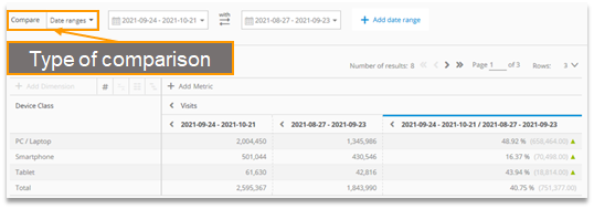
All data that has been tracked in at least one of the chosen time ranges is considered for the comparison. In the example, this is all data between August 27th and September 23rd and between September 24th and October 21st.
The comparison column shows the relative and absolute differences of the metric values.
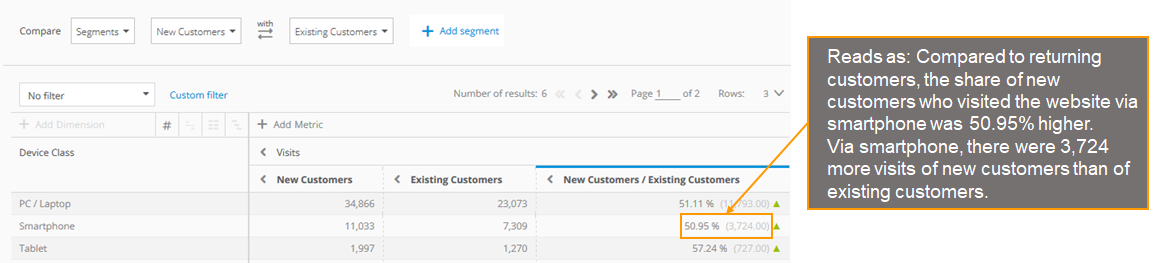
| Calculation of the Comparison percentage value | ((Figure left column / Figure right column ) -1) * 100 |
|---|
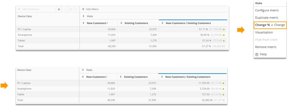
Make a right-click on the metric and click „Change % ⇄ Change“ to switch between showing the relative or absolute numbers first. Note that this is especially useful if you sort for this column.
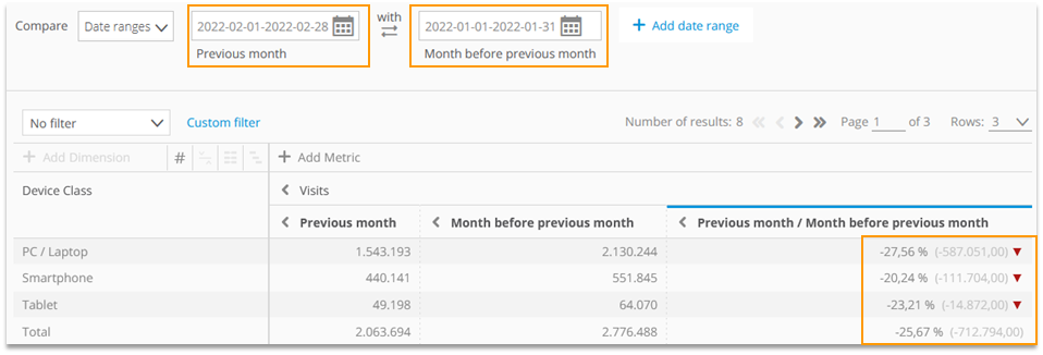
Up to three elements (e.g., last week, week before the last week, last week in the previous year) and 5 metrics or formulas can be compared.
The result always relates to the periods that you chose - also when using time comparison for periods of different lengths.
In the following example, the most probable reason why the number of visits dropped is that we compare 28 days with 31 days:
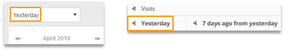
As an alternative, time periods can be set manually.
Choose a dynamic time period in the calendar to improve the readability of your analysis (e.g., „Yesterday“ instead of „May 27th“).
For a clear arrangement, single elements can be hidden.
2.3.4 Path
The Path view shows the order in which elements were viewed.
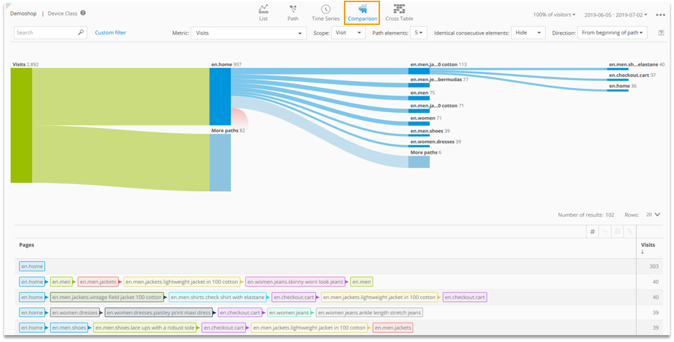
This view consists of a clickable diagram that allows for an aggregated, interactive evaluation, as well as a data table that shows all paths that were tracked.
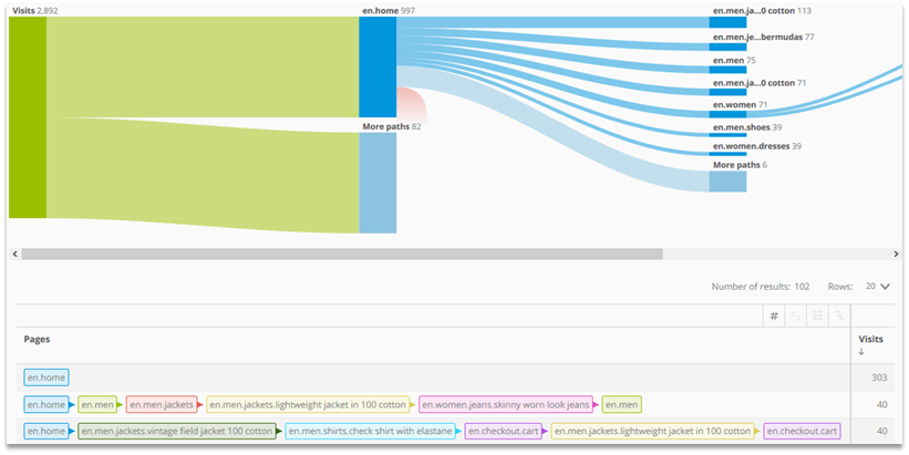
The diagram shows only paths that are also shown in the data table. |
|---|
- Paths can be limited to a page, a visit, or to the analysis period.
- Within a path always exactly one dimension can be used.
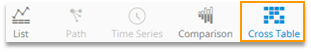
Activating the Path view
- In an analysis, click on the path symbol.
- Configure the path.
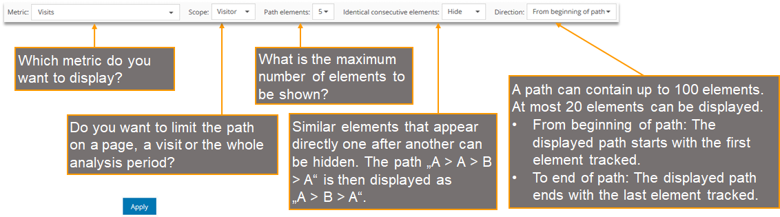
- Click on Apply.

2.3.5 Cross Table
The Cross Table allows to combine two dimensions in one analysis.
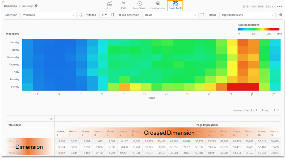
- When combining the dimension and the crossed dimension, always the smallest common scope is used.
- You can use a maximum of 60 elements of the crossed dimension. This corresponds to the maximum number of columns that you can add.
Activating the Cross Table View
- Click on the Cross Table symbol in an analysis.
Configure the Cross Table.
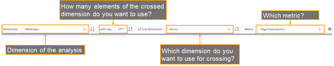
- Click on Apply.

Sorting in the Cross Table view
Depending on the chosen dimensions, different kinds of sorting can be applied.
For each kind of sorting, you can sort ascending or descending.

- Sorting by the dimension (only for some dimensions, e.g., Weekdays)
Example: Do you want the analysis to start on Monday or Sunday?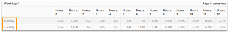
- Sorting by metric values
Example: Do you want the analysis to show the hours with the highest or least number of Page Impressions across all weekdays?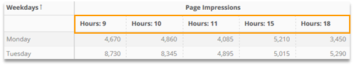
Sorting by the crossed dimension (only for some dimensions, e.g., Hours)
Example: Do you want the analysis to start with Hour 0 or Hour 23?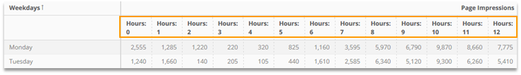
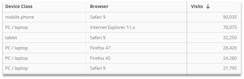
2.4 Multidimensional Analyses (Pivot table)
By adding one or more dimensions, a pivot table can be created.
This way, complex questions can be answered by using an analysis.
The hierarchy view and list view are supported.
Hierarchy view:
List view:
Creating a Pivot table
To create a Pivot table add at least one other dimension to the analysis.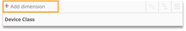
Switch between hierarchy and list view by using the respective buttons.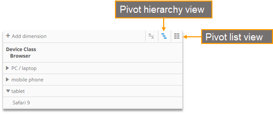
In the hierarchy view dimensions can be sorted using drag & drop.
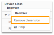
Dimensions can be removed with the help of the context menu.
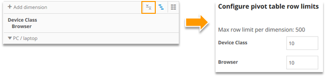
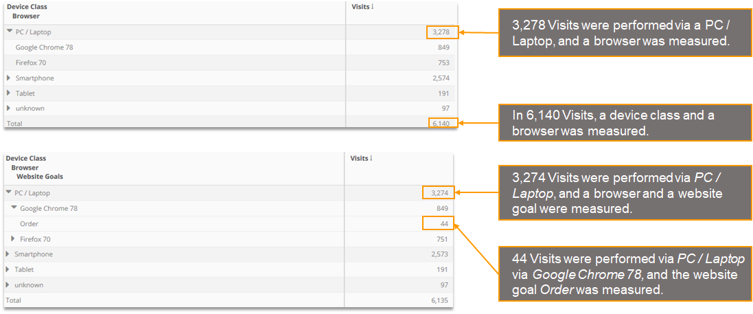
Using the icon, it is possible to adjust the row limit in the hierarchy view.
The number shown for the upper dimension element shows the unique total number of metric values for all elements on the levels below (also in the case where not all elements are shown).
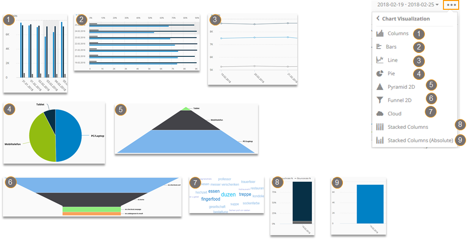
2.5 Diagram, Visualization and Readability
2.5.1 Diagram, Visualization, and Readability
The diagram is structurally divided into three parts:
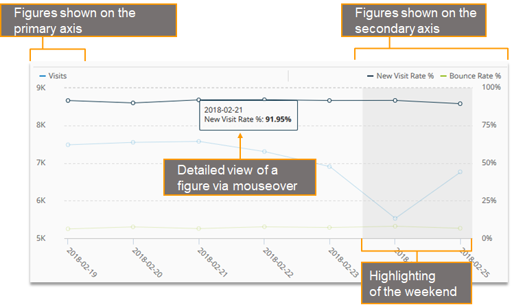
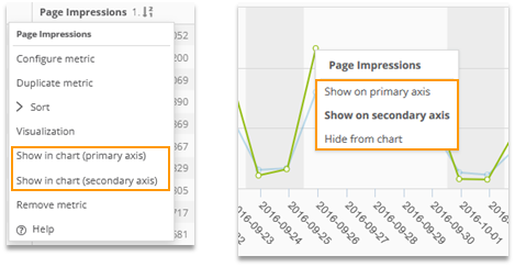
A metric or formula can be displayed on the primary axis (left) or the secondary axis (right).
The metric or formula can be added or removed from the diagram by right-clicking on the name in the table or by right-clicking on a data point in the diagram.
You can choose between different types of diagrams:
2.6.2 Visualization in the data table
You also can visualize metrics and formulas in the data table.
This way, you can analyze data faster, and it is easier to spot differences.
There are different visualizations available: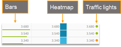
- The traffic light uses three different colors (red, orange, green). The heatmap uses five colors (from light blue to dark blue).
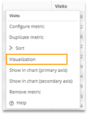
- The visualization can be configured in the context menu.
The visualization of metrics and formulas is not available in multidimensional analyses. |
|---|
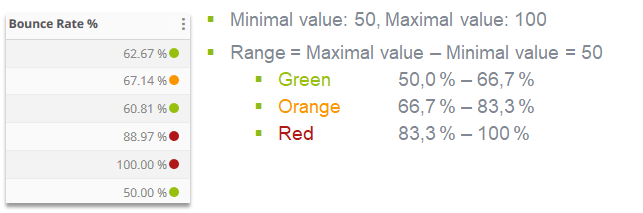
Coloring of traffic lights in a heatmap is done automatically on the basis of the shown values, but it also can be adapted manually.
- The Target value defines whether a high value (max) or a low value (min) is considered to be good. The best values are shown in green (traffic light) or dark blue (heatmap), respectively.
- Automatic Colouring
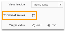
To determine the threshold values, the highest and lowest values shown are used.
The range of values is divided into three (traffic light) or five (heatmap) parts,
respectively.Example: Traffic light with target value „min“
- Manually chosen coloring
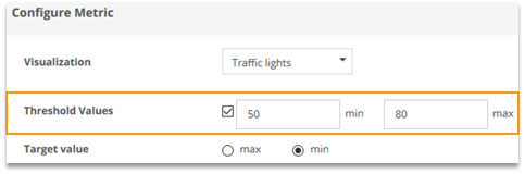
You can also choose the coloring manually.
The value range is divided into three (traffic light) or five (heatmap) parts, respectively.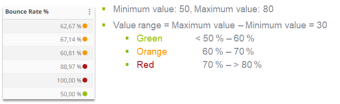
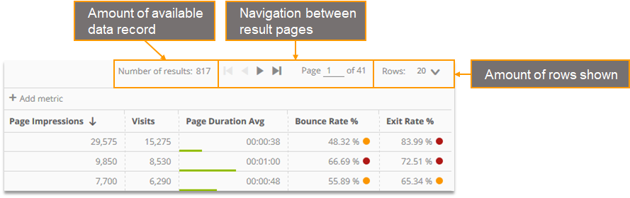
2.5.3 Rows shown in an analysis
2.5.4 Enumeration
Rows in the data table can be enumerated. It is not available in multidimensional analyses (pivot tables).
It has to be activated separately for each analysis.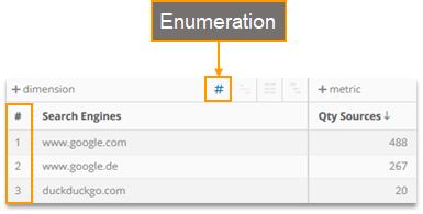
2.5.5 Footer
The „Total“ footer shows the uniquely calculated aggregated value for each metric. The „Total“ value for formulas is calculated using the uniquely calculated values of the underlying metrics.
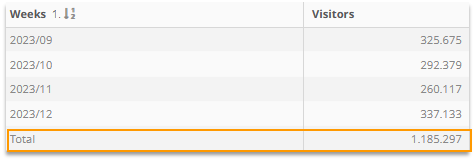
In the example, a visitor that was tracked each week would only be counted as one visitor in the „Total“ row.
In the analysis variant „Time Series“ the footer is not available. |
|---|
2.5.6 Full-Screen Mode
If the Full Screen Mode is activated, the main menu and the top navigation are hidden.
To (de-)activate the full-screen mode click on the arrow symbol next to the analysis path.
2.6 Filter
You can filter a whole analysis as well as single metrics and formulas.
2.6.1 Filtering Analyses
Analyses can be filtered using the quick search or filter function.
Quick Search: Only certain elements of the dimension are shown.
Example: In the Search Engine analysis, show only Google Search Engines.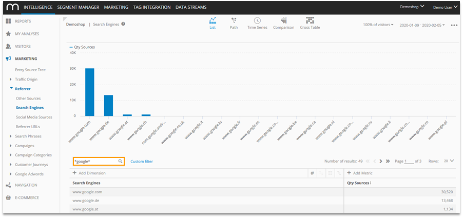
The search input is provided either as a free text or drop-down field.
- Free text field
In most analyses, the search keyword is entered into a free text field.- Suggestion function
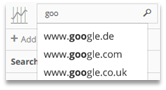
Maximum of 8 suggestions
Only data is recommended that has been shown previously with this login. - Placeholder
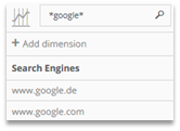
With placeholders (*) any strings can be replaced.
Multiple placeholders are allowed.
- Suggestion function
- Drop-down input
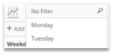
A drop-down field is available for several dimensions (e.g., Weekdays, Segments).
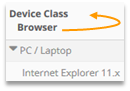
In multidimensional analyses, the quick search relates to the first dimension. |
|---|
The filter function allows for filtering all available dimensions and metrics.
Example: Show only Google search engines if a tablet was used within the same visit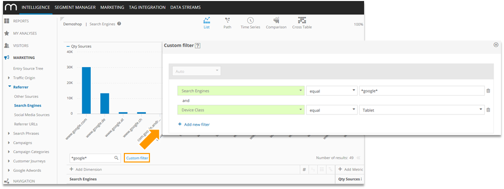
Detailed information on the filter function can be found in the training chapter Segmentation and Filter Options. |
|---|
Using the drill down, selected dimensions of an analysis can be adopted as filters for a follow-up analysis.
Multiple elements can be selected at the same time
Example: In the New vs. Returning-Analysis new visitors are selected, and a drill-down to the Pages Analysis is made.
- Highlight the dimension elements with the mouse.
Only necessary if more than one element is chosen.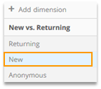
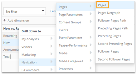
Right-click for drill-down and choose the follow-up analysis.
Output of the filtered analysis

Please note that the filter is saved for the time of your Mapp Intelligence session.
If you want to remove the filter, reload your browser.
2.6.2 Filtering metrics and formulas
In the context menu (Configure Metric ) it is possible to adjust every metric and formula individually.
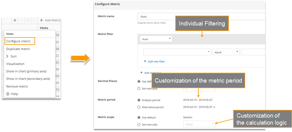
Detailed information on the configuration of metrics can be found in the training chapter Custom Figures. |
|---|
2.7 Saving Analyses
Analyses can be saved at My Analyses or as a report.
The following table shows the different functions when saving an analysis at My analyses or as a report element.
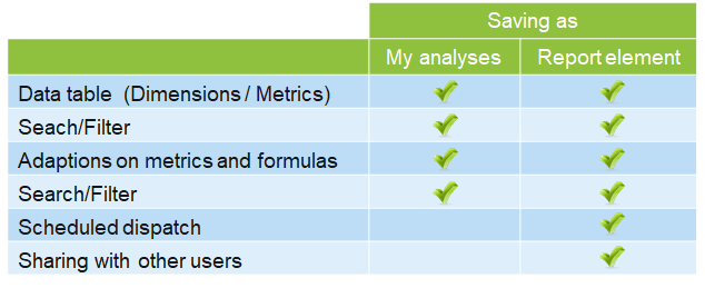
Detailed information on Reports can be found in the training document Custom Reports. |
|---|
2.7.1 My Analyses
At „My Analyses“, analyses can be saved permanently for a user.
- Saving at My Analyses
Click on Add to > My Analyses. Think of an informative title.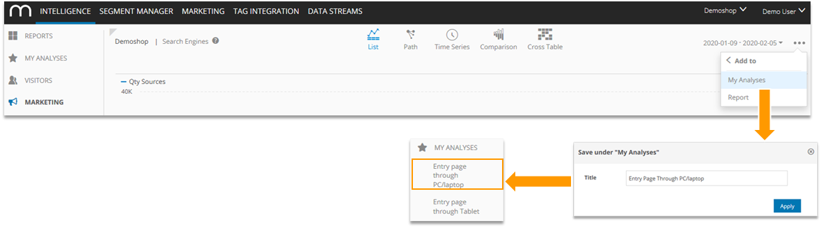
The saved analyses are sorted alphabetically in the main menu. - Deleting an analysis at My Analyses
A saved analysis can be directly deleted in the main menu.
Via mouseover, a respective symbol will be shown.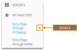
2.8 Export
Analyses can be downloaded or sent via email as Excel, PDF, or CSV files.
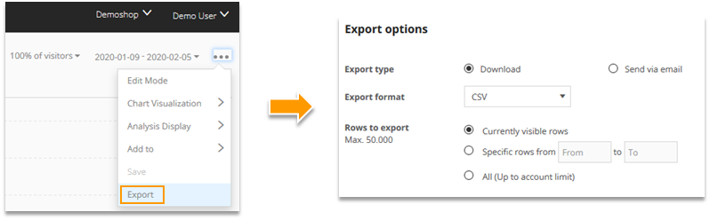
- Exports always use 100 percent of the data – even if the quick calculation mode was used.
- Only PDF files include diagrams and visualizations of metrics and formulas.
- The number of rows that can be exported depends on the individual contract.
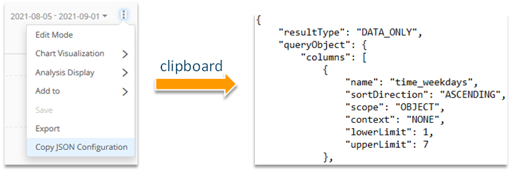
2.9 Copy JSON Configuration
When you are using the Intelligence API, you need to get the JSON configuration of your analysis. When you finish building your analysis, click “Copy JSON Configuration” to copy the JSON into your clipboard.
2.10 Help
Help is available at the following points: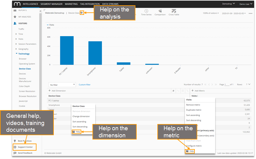
Please note that Mapp Intelligence was named "Webtrekk Analytics" until February 2020. We work on substituting the old name with the new one. However, it may happen that descriptions still contain "Webtrekk Analytics". The content of the document is up to date.